Our Marketing Team at PopaDex
Understanding Average Rate of Return in Investing

When you’re trying to figure out how your investments are really doing, the average rate of return is your go-to metric. It cuts through the noise of daily market swings and year-to-year drama, boiling everything down to a single, easy-to-understand percentage.
Essentially, it answers the simple question: “Over the long haul, how much am I actually making on this thing?” Getting a handle on this number is the first step to making smarter moves with your money.
Decoding Your Investment Journey
Think of your investment portfolio like a long-distance flight. There’s the bumpy takeoff (maybe some initial losses), periods of smooth cruising at high altitude (strong gains), and the occasional patch of turbulence (market dips). If someone asked how the flight was, you wouldn’t list every single change in altitude. You’d give them the big picture—the average.
The average rate of return does the exact same thing for your finances. It smooths out all the highs and lows into one clear figure. And that single number is more powerful than you might think.
- It sets realistic goals. Knowing what’s typical helps you avoid chasing impossible returns or getting discouraged by normal market behavior.
- It lets you compare apples to apples. Is your real estate investment outperforming your stock portfolio? This metric gives you a standard benchmark.
- It tells you if your strategy is working. Are you on track to hit your retirement goals? Your average return is the clearest indicator.
Ultimately, understanding this concept is what separates passive passengers from confident pilots of their own financial futures. It gives you the insight needed to read the dashboard and make decisions with confidence.
A Look at Typical Investment Returns
Not all investments are created equal. Historically, different asset classes deliver very different average returns, and knowing these benchmarks is key to judging your own performance. This infographic breaks down the typical annual returns you can expect from major investment types.
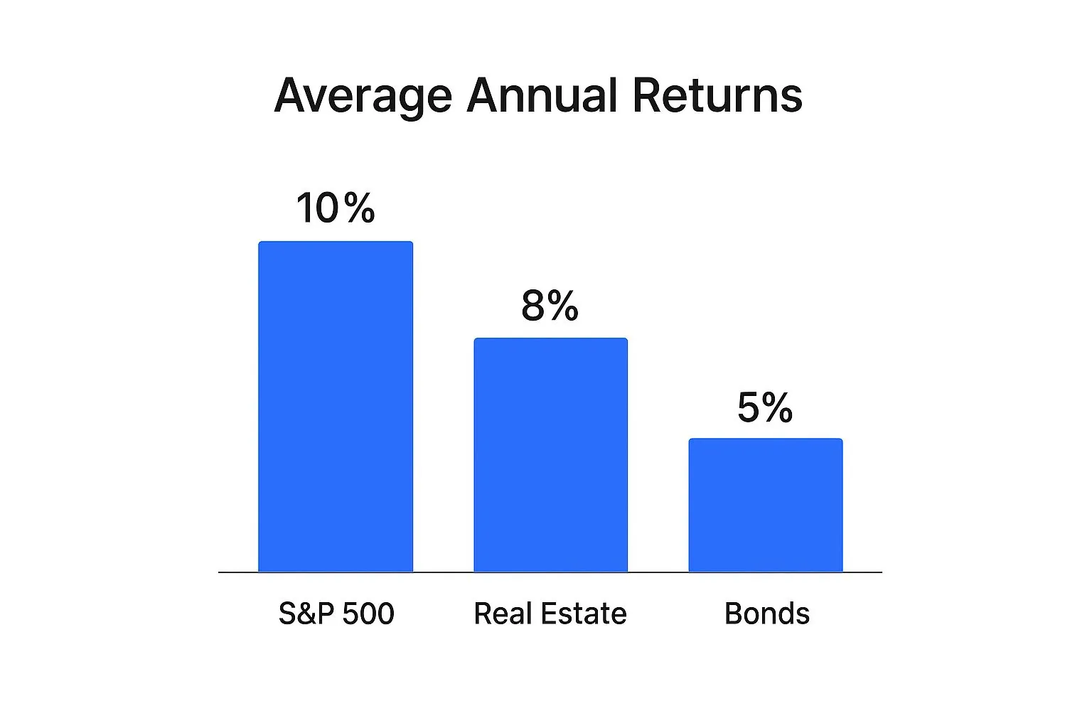
As you can see, something like the S&P 500 generally offers higher average returns, but that often comes with a wilder ride (more volatility) compared to the slow-and-steady nature of bonds.
By understanding these historical averages, you can better contextualize your own portfolio’s performance. If your stock-heavy portfolio is averaging 4% while the market is averaging 10%, it’s a clear signal to re-evaluate your strategy. This single number acts as your financial compass.
How To Calculate Your Average Rate of Return
Figuring out your average rate of return goes beyond Wall Street wizards; it’s a fundamental skill for any investor. Luckily, it comes down to two main methods. Each tells a slightly different story about your investment’s performance, and knowing both gives you the full picture.
The first and most common approach is the arithmetic mean. Think of it like a simple average you’d use for test scores. You just add up the returns for each period and divide by the number of periods you’re looking at.
While it’s quick and easy for a back-of-the-napkin calculation, it has one significant blind spot. The arithmetic mean completely ignores the effect of compounding, which can paint a slightly rosier, and less realistic, picture of your actual growth over time.
The Simple Approach: Arithmetic Mean
Calculating the arithmetic mean is straightforward. Let’s imagine an investment had the following returns over a three-year stretch:
- Year 1: +20%
- Year 2: -10%
- Year 3: +15%
You just add them up: (20 - 10 + 15 = 25). Then, divide by the number of years, which is 3.
In this case, 25 ÷ 3 gives you an arithmetic average return of 8.33%. It’s a useful number, but it doesn’t quite capture how your money actually grew year over year. For that, we need a more sophisticated tool.
The Investor’s Choice: Geometric Mean
For a true measure of performance, investors turn to the geometric mean. This method is superior because it accurately accounts for the powerful force of compounding—the process where your returns start earning their own returns.
The math is a bit more involved, but it gives you a far more honest look at your investment’s journey, especially when dealing with the inevitable ups and downs of the market. It answers the crucial question: “What steady, constant return would I have needed each year to get to my final portfolio value?”
The geometric mean will almost always be lower than the arithmetic mean. Don’t be discouraged by this; it’s simply a more accurate reflection of your portfolio’s real compound annual growth rate (CAGR).
Let’s use the same returns from our example to see how it works.
- First, convert each percentage to a decimal and add 1. (So, 20% becomes 1.20, -10% becomes 0.90, and 15% becomes 1.15).
- Next, multiply these values together: 1.20 × 0.90 × 1.15 = 1.242.
- Then, take the nth root of that number, where n is the number of years. In our three-year example, we take the cube root of 1.242, which is about 1.075.
- Finally, subtract 1 and multiply by 100 to get the percentage: (1.075 - 1) × 100 = 7.5%.
Notice the difference? The geometric mean is 7.5%, while the arithmetic mean was 8.33%. That 7.5% represents the actual, compounded growth your investment achieved each year.
To see this side-by-side, let’s break down the calculations for the same investment returns.
Arithmetic vs Geometric Mean Calculation Example
| Year | Annual Return | Arithmetic Mean Calculation Step | Geometric Mean Calculation Step |
|---|---|---|---|
| Year 1 | +20% | Add 20 | Convert to 1.20 |
| Year 2 | -10% | Subtract 10 | Convert to 0.90 |
| Year 3 | +15% | Add 15 | Convert to 1.15 |
| Total/Product | Sum = 25 | Product = 1.242 | |
| Calculation | 25 / 3 years | (1.242)^(1/3) - 1 | |
| Result | 8.33% | 7.5% |
As you can see, the geometric mean provides a more conservative and realistic measure of performance by accounting for how returns build on each other.
If you want to dig into these calculations with more examples, our guide on how to calculate your rate of return is a great place to start. For a deeper look at applying these concepts across your entire portfolio, this resource on how to calculate portfolio returns accurately is also incredibly helpful.
Using Historical Benchmarks to Judge Your Performance
Calculating your average rate of return is a crucial first step, but the number itself doesn’t exist in a vacuum. A 7% return might feel great, but how do you know if it’s truly a strong performance? To answer that, you need context, and the best context comes from historical market benchmarks.
Comparing your results to an established benchmark is like checking your car’s speedometer against the highway’s speed limit. It tells you if you’re keeping pace, falling behind, or maybe even taking on too much risk to get ahead. For the U.S. stock market, the most widely used benchmark is the S&P 500 index.
The S&P 500: A Reliable Yardstick
For nearly a century, the S&P 500 has been the primary gauge of the stock market’s health. It tracks 500 of the largest and most influential public companies in the United States, giving you a broad and reliable snapshot of the overall economy. It’s the yardstick everyone uses.
Historically, the average annual return for the U.S. stock market, measured by the S&P 500, has hovered right around 10% since 1926. That figure goes beyond stock prices climbing; it importantly includes the reinvestment of dividends, which is a huge part of long-term growth.
But that smooth average hides a much wilder reality. The market is volatile, swinging from a massive 37.6% gain in 1995 to other years with painful declines. If you want to dive into the nitty-gritty, NYU Stern keeps a fantastic breakdown of historical S&P returns.
This 10% figure is your starting point—a powerful number for setting expectations. If your stock-heavy portfolio is consistently lagging behind this long-term average, it might be time to review your strategy or check the fees you’re paying. The easiest way to do this is with dedicated portfolio analysis tools that track your performance against key benchmarks automatically.
Looking Beyond the Headline Number
That famous 10% average is what’s known as a nominal return. It’s the raw number before accounting for a crucial, invisible force that eats away at your gains: inflation. To understand your true progress, you need to calculate your real rate of return.
The formula is refreshingly simple:
Real Return = Nominal Return − Inflation Rate
So, if your portfolio earns 9% in a year where inflation is 3%, your real return—the actual increase in your purchasing power—is only 6%. This distinction is critical. You aren’t just trying to grow your money; you’re trying to grow your ability to buy things with it in the future.
When you factor in inflation, that historical S&P 500 average adjusts down to a more modest 6-7% per year. This “real” benchmark is often a much more realistic target for your long-term goals, as it reflects genuine wealth creation after accounting for the rising cost of living.
The Hidden Risks of Relying Only on Averages
https://www.youtube.com/embed/ncq1JLdEAKA
While the average rate of return is a fantastic starting point, relying on it exclusively is like judging a movie by its poster. It gives you the general idea but completely misses the plot twists.
A high average can easily mask underlying issues that smart investors need to spot. The story behind the number is often more important than the number itself.
One of the biggest hidden dangers is volatility. Imagine two investments that both delivered an average return of 8% over five years. Investment A grew steadily year after year, like a slow and steady climb up a hill.
Investment B, on the other hand, soared 40% one year and plummeted 25% the next. While their averages are identical, their journeys were wildly different. That second path might be far too stressful for your personal risk tolerance, even if the final number looks good on paper.
The Problem with Timing
Another critical flaw is how averages can be skewed by the timeframe you choose. This is a concept known as endpoint bias.
Calculating an average from the bottom of a market crash to the peak of a recovery will produce a phenomenal, yet misleading, return. Starting the calculation just one year earlier or later could paint a completely different picture of the investment’s health.
This highlights a fundamental limitation: an investment’s average rate of return doesn’t always reflect your personal profit.
A simple average fails to account for the most important variable in your financial story: you. It ignores the timing of your actual deposits and withdrawals, which dramatically impacts the money you ultimately make.
For example, if you invested a large sum right before a market downturn, your personal experience will be far worse than what the simple average suggests. Conversely, adding funds during a dip can significantly boost your real-world gains.
These personal actions create a gap between the theoretical average return of an asset and the actual money-weighted return you achieve. Understanding this distinction is key to gaining a true perspective on your portfolio’s performance.
Tracking Your True Performance with PopaDex

Calculating your average rate of return by hand is a great way to learn the ropes, but let’s be honest—it gets old fast. Wrestling with spreadsheets, double-checking formulas, and logging every single transaction is tedious, error-prone, and steals time from what really matters: your investment strategy.
For any serious investor, moving beyond manual tracking isn’t a luxury; it’s a necessity. You need a system that handles the heavy lifting, giving you an accurate, real-time picture of your performance without the headache. This is how you shift from crunching numbers to making smart, informed decisions.
Go Beyond Spreadsheets for Accurate Insights
A basic spreadsheet can tell you a simple average, but it often misses the full story of your personal returns. Modern tools like PopaDex are built to handle the complexities that make spreadsheets buckle, like factoring in the precise timing of your deposits and withdrawals.
Instead of a one-size-fits-all average, PopaDex calculates the metrics that truly matter. These give you a much clearer picture of what’s going on with your money.
- Time-Weighted Return (TWR): This metric strips out the effect of your cash flows to show the pure performance of your investments. It’s the perfect way to benchmark your strategy against something like the S&P 500.
- Money-Weighted Return (MWR): Also known as the Internal Rate of Return (IRR), this shows your actual personal performance. It accounts for the size and timing of every dollar you put in or take out.
By automating both TWR and MWR, PopaDex tells the complete story. You see how well your investment picks performed on their own and how your timing impacted your final results. It turns raw data into real, actionable insight.
If you’re still managing things manually, our free investment tracking spreadsheet is a solid place to start. But for seamless, automated analysis that gives you back your time, a dedicated platform is the way to go.
Visualize Your Financial Journey
The best tools don’t just spit out numbers; they make them easy to understand. PopaDex turns your portfolio data into a clean, intuitive dashboard, letting you see your progress at a glance. No more squinting at endless rows of data.
You can instantly spot trends, compare how different assets are growing, and see how you’re tracking against your goals.
This kind of clear visual feedback is what keeps your strategy on track. It helps you see what’s working, what’s not, and what you need to do to hit your financial targets.
Answering Your Top Questions About Investment Returns
Jumping into the world of investing can feel like learning a new language, especially when you’re trying to figure out how well you’re actually doing. Let’s tackle some of the most common questions investors have about the average rate of return, breaking them down into simple, straightforward answers.
Getting these answers right gives you a much richer picture of your financial health than just a single number. It helps you ground your expectations in reality and understand the forces that shape your portfolio’s growth.
What Is Considered a Good Average Rate of Return?
This is the million-dollar question, and the honest answer is: it depends entirely on you. A “good” return is deeply personal and hinges on your financial goals, how long you plan to invest, and how much risk you’re comfortable with.
That said, the most common measuring stick is the S&P 500. Over its long history, it has delivered an average annual return of around 10%.
If your portfolio is heavy on stocks and you’re consistently hitting or beating that 10% benchmark, you’re in great shape. For assets that are typically less volatile, the goalposts move:
- Bonds: A solid return here might be in the 4-6% range.
- Real Estate: This asset class has historically been around 8-10%, but it comes with its own unique set of risks.
At the end of the day, a “good” return goes beyond beating the market. It’s about finding a rate that keeps you on track to hit your personal financial milestones without losing sleep at night. It’s about progress, not just bragging rights.
How Does Inflation Affect My Average Rate of Return?
Think of inflation as a silent tax on your investment gains. It quietly eats away at your money’s buying power, which means the return you see on paper—your nominal return—isn’t the whole story. What you really care about is your real return.
Figuring out your real return is surprisingly simple: just subtract the year’s inflation rate from your portfolio’s return.
Let’s say your investments grew by 9% in a year where inflation was 3%. Your real average rate of return is actually just 6%. That 6% is the true measure of how much your purchasing power has increased. Ignoring inflation can trick you into thinking you’re much further ahead than you really are.
Always aim for returns that comfortably beat inflation. That’s how you build real, lasting wealth.
Why Are My Personal Returns Different from the Market Average?
This is a classic head-scratcher for many investors. The news says the S&P 500 is up 12%, but you check your account and you’re only up 9%. What gives? Don’t worry, it’s completely normal for your returns to not perfectly mirror a market index.
Here are a few key reasons why:
- Your Portfolio Isn’t the Index: Unless you bought a single S&P 500 index fund, you don’t own the exact same stocks in the exact same amounts. Your unique mix of assets—like bonds, international stocks, or real estate—will naturally lead to different performance.
- Fees and Expenses: Market indexes are just numbers; they don’t have fees. Your investments, whether in mutual funds, ETFs, or managed by an advisor, have small costs that create a slight drag on your performance.
- The Timing of Your Investments: This is the big one. Market indexes are calculated as if you invested a lump sum on January 1st and didn’t touch it. But most of us invest periodically, adding money from our paychecks. When you buy and sell has a huge impact on your personal return.
This is exactly why tracking your own, personalized average rate of return is so much more valuable than just stacking yourself up against a generic benchmark. Your return tells your story.
Ready to stop guessing and start tracking your true performance with precision? PopaDex automates these complex calculations, giving you a clear, real-time view of your entire financial world. Sign up today and gain the clarity you need to reach your goals. Learn more at https://popadex.com.