Our Marketing Team at PopaDex
Your Guide to a 50 30 20 Budget Spreadsheet

A 50/30/20 budget spreadsheet is more than another financial tool; it’s a practical, straightforward way to get your money organized. At its core, it splits your after-tax income into three simple buckets: 50% for Needs, 30% for Wants, and 20% for Savings and Debt Repayment. This approach cuts through the confusing jargon, giving you a clear, visual roadmap to manage your cash and finally hit your financial goals.
Why a 50/30/20 Spreadsheet Actually Works
The real genius of the 50/30/20 rule isn’t the numbers themselves—it’s the psychological breathing room it creates. So many budgets fail because they’re way too rigid. They make you track every single penny and feel guilty for any discretionary spending. This method is different because it builds flexibility right into its DNA.
By deliberately carving out 30% of your income for “Wants,” you’re giving yourself permission to enjoy life without wrecking your financial progress. That built-in allowance for fun—whether it’s grabbing dinner with friends, buying a new gadget, or taking a weekend trip—is what makes the budget sustainable. You’re far less likely to give up on a plan that doesn’t feel like a punishment.
The Foundation of Financial Clarity
The system’s true power is its simplicity. Instead of juggling dozens of tiny categories, you’re only focused on three main buckets. This forces you to get real about where your money is going.
To give you a clearer picture, here’s a quick breakdown of how your after-tax income gets divided.
Quick Guide to 50/30/20 Category Breakdowns
| Category | Percentage | What It Covers | Example Expenses |
|---|---|---|---|
| Needs | 50% | The absolute essentials you need to live and work. | Rent/mortgage, utilities, essential groceries, transportation. |
| Wants | 30% | Lifestyle choices that improve your quality of life but aren’t vital. | Dining out, hobbies, streaming services, vacations. |
| Savings & Debt | 20% | Your future-focused money for goals and paying down what you owe. | Emergency fund, retirement, student loans, credit card debt. |
This framework simplifies financial choices. A purchase is no longer just about whether you can afford it. Instead, you’ll find yourself asking, “Which bucket does this come from, and do I have room in it?”
This strategic allocation simplifies decision-making. When considering a purchase, you no longer just ask, “Can I afford this?” Instead, you ask, “Which bucket does this come from, and do I have room?”
Popularized by Senator Elizabeth Warren in her book All Your Worth, the 50/30/20 rule has become a go-to for personal finance because it offers a solid but adaptable foundation. Think of it as a guideline, not an unbreakable law, designed to make you more aware of your spending habits.
If you want to explore the philosophy behind it further, you might find our guide on mastering budgeting for financial freedom helpful. You can also find more on the rule’s background over at Moneyzine.com. For now, building your own 50/30/20 budget spreadsheet is the perfect first step to putting this proven strategy into action.
Building Your Spreadsheet From a Blank Sheet
Alright, let’s move from theory to action. This is where we’ll roll up our sleeves and build a dynamic, automated 50/30/20 budget spreadsheet from scratch using a tool like Google Sheets or Excel.
Sure, pre-made templates can give you a head start. If you want to see what’s out there, you can explore some of the best personal budget spreadsheet templates for 2025 to get a feel for different layouts. But honestly? Building your own gives you total control and a much deeper understanding of where your money is going.
We aren’t just making a glorified list of expenses. The goal here is to build an automated system that works for you.
Establishing Your Core Structure
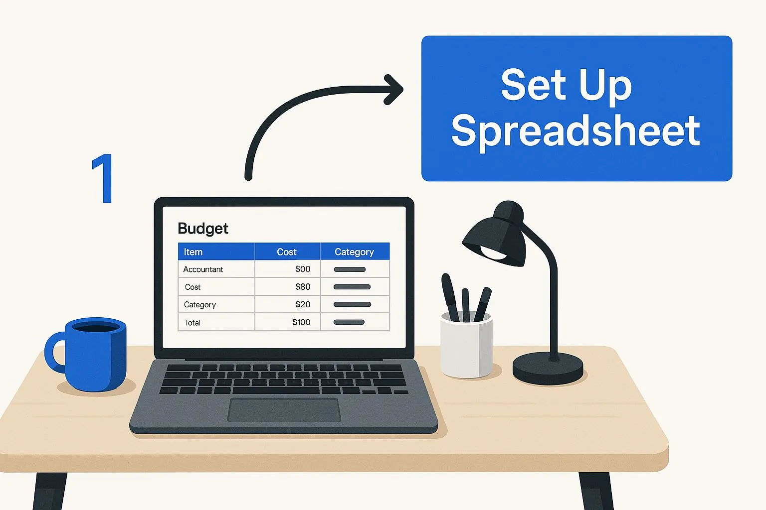
The first thing we’ll do is set up a clean, two-tab structure. Just open a blank spreadsheet and create two separate sheets at the bottom.
- Tab 1: Monthly Log: Go ahead and rename this sheet to the current month, like “October 2024.” This will be your daily workhorse, the place you log every single transaction as it happens. You’ll just duplicate this sheet for each new month.
- Tab 2: Annual Dashboard: This is your command center. It will pull all the data from your monthly logs to give you the big-picture view, track your progress, and see how you’re stacking up against your 50/30/20 targets.
Now, click into your “Monthly Log” sheet. Let’s create these four columns: Date, Item/Description, Category, and Amount. These are the absolute foundation of your tracker. I always recommend making the header row bold and maybe adding a light fill color to make it stand out. It’s a small touch, but it makes data entry so much easier on the eyes.
Setting Up Your Categories
Here’s where the real magic happens—getting the spreadsheet to automatically categorize your spending for you. In your “Monthly Log” sheet, click on the entire “Category” column. Now, find the Data Validation feature (in Excel, it’s under the Data tab; in Google Sheets, it’s under Data > Data validation) to create a dropdown list.
Using a dropdown menu for categories is a total game-changer. I can’t stress this enough. It stops you from making typos and keeps your data clean (no more “Groceries” one day and “grocery” the next), which is critical for making sure your formulas work flawlessly.
For your dropdown list, you’ll want to include the three main buckets: Needs, Wants, and Savings/Debt. Now, when you log an expense—let’s say, your internet bill—you just select “Needs” from the list. This simple act of standardizing your entries is what unlocks all the powerful automation we’ll set up later.
This visual gives you a quick look at how these pieces fit together.
As the graphic shows, this initial setup might seem basic, but it’s the bedrock for creating a truly effective financial tool right on your laptop.
Next, flip over to your “Annual Dashboard” sheet. This is where we’ll build the summary section. You’ll need a spot to put your total monthly after-tax income. Then, create labels for your three core categories.
Your Dashboard Layout
- Income: First, create a cell labeled “Monthly Take-Home Pay.” This is where you’ll manually type in your net income each month.
- Budget Targets: Next, make cells that show your 50%, 30%, and 20% targets in dollar amounts. For instance, if your income is $4,000, these cells would show $2,000, $1,200, and $800.
- Actual Spending: Finally, create labels for “Total Needs,” “Total Wants,” and “Total Savings/Debt.” These cells are where the formulas will live, automatically pulling and summing up the data from your monthly log.
This structure is designed to keep your daily data entry separate from your high-level analysis, which keeps everything clean and easy to manage. Now that the foundation is laid, we’re ready for the fun part: adding the formulas that will bring this whole thing to life.
Using Formulas to Automate Your Budget
A well-structured spreadsheet is great, but let’s be honest—a smart spreadsheet that does the heavy lifting for you is a whole lot better. This is where we add the magic, turning your static sheet into a dynamic financial tool. Your 50/30/20 budget spreadsheet is about to come alive, automating all the math to give you instant clarity.
Forget about manually adding up rows of expenses. We’re going to plug in a few specific formulas to automatically tally your spending and show you exactly where you stand against your goals.
Automating Your Category Totals
The most valuable function for this job is SUMIF. It’s a powerhouse that lets you add up numbers in one column, but only if they meet a certain condition in another column. It’s practically tailor-made for what we need to do.
First, click over to your “Annual Dashboard” sheet and find the cell you labeled “Total Needs.” In this cell, you’ll type a formula that tells your spreadsheet to do three things: look at your “Monthly Log” sheet, find every single expense you’ve categorized as “Needs,” and add up their amounts.
The formula will look something like this:
=SUMIF('October 2024'!C:C, "Needs", 'October 2024'!D:D)
Let’s break that down into plain English:
'October 2024'!C:C: This is the range to check. It tells the formula to look at the entire “Category” column (column C) on your monthly log sheet."Needs": This is the criterion. It will only pull rows where the category is exactly “Needs.”'October 2024'!D:D: This is the range to sum. For every row that meets the criterion, it adds up the number from the “Amount” column (column D).
You’ll repeat this exact process for your “Wants” and “Savings/Debt” totals. Just swap out “Needs” for “Wants” or “Savings/Debt” in the formula. This simple step means you’ll never have to do that manual math again.
Calculating Your Progress in Real-Time
With your totals automatically pulling in, the next step is to see how your spending stacks up against your 50/30/20 targets. This just requires a simple percentage calculation.
Next to your “Total Needs” amount on the dashboard, create a new cell. Here, you’ll divide your total spending for that category by your monthly take-home pay. For instance, if your “Total Needs” amount is in cell B5 and your “Monthly Take-Home Pay” is in cell B2, the formula is just:
=B5/B2
Make sure to format this cell as a percentage. Instantly, you have a real-time progress bar. If your income is $4,000 and you’ve spent $1,500 on needs so far, this cell will show 37.5%. Right away, you know you’re well within your 50% target. Do the same for your Wants and Savings categories.
This instant feedback is the most powerful part of an automated spreadsheet. Seeing those percentages update with every logged expense creates a direct connection between a small purchase and your overall financial picture. It’s a powerful motivator.
Here’s a great visual of how the SUMIF function is structured in Google Sheets.

As the image shows, the formula simply connects a condition (the category name) to the numbers you want it to add up.
Finally, let’s add one more useful feature: a “Remaining Budget” tracker. For each category, just subtract your actual spending from your target amount. If your 50% target for Needs is $2,000 and you’ve spent $1,500, a simple subtraction (=Target - Actual) shows you have $500 left. This gives you a clear, immediate answer to that all-important question: “How much do I have left to spend?”
Visualizing Your Spending With Charts
Let’s be honest, staring at rows of numbers in a spreadsheet can feel like a chore. It’s just data. But when you turn that data into a visual story, something clicks. It becomes information you can actually use—instantly. A 50/30/20 budget spreadsheet with a few good charts is a completely different beast than one without them. It transforms overwhelming expense lines into clear, simple insights.
Visuals are a game-changer for staying motivated. It’s one thing to know you overspent on “Wants” last month. It’s another thing entirely to see it staring back at you as a giant slice of a pie chart. That immediate feedback is what helps good habits stick and flags problem areas before they get out of hand.
The Instant Clarity of a Pie Chart
First up, the most powerful visual for this specific budget: the pie chart. Its job is simple: to give you a single-glance summary of how your spending actually breaks down across your three main categories. It answers the most important question: “Am I actually sticking to the 50/30/20 rule?”
Creating one is surprisingly easy. Just highlight your three “Actual Spending” totals on your Annual Dashboard—the final numbers for Needs, Wants, and Savings/Debt—along with their labels. Then, find the “Insert Chart” option in whatever spreadsheet tool you’re using and pick the pie chart. Boom. You now have a colorful, dead-simple graphic showing your exact spending distribution.
A well-designed chart does more than just show you data; it makes that data personal and actionable. It’s the difference between reading a statistic and feeling its impact on your financial life.
This is more than a hunch; the results speak for themselves. A 2024 survey revealed that 67% of people using budget spreadsheets felt more in control of their money, and they pointed to color-coded charts as a key feature that helped them stick to their plan. You can dive deeper into the study and view the full findings here. That sense of control is exactly what we’re aiming for.
Spotting Spending Trends With a Bar Chart
While a pie chart gives you a great snapshot of a single month, a bar chart is your tool for spotting trends over time. This is where the magic really happens. You can finally see if your “Wants” category always seems to spike during the summer or if your grocery bill slowly creeps up during the winter months.
To get this going, you’ll need a small table on your dashboard that lists each month. Next to each month, simply pull in the total spending for each of your three big categories (Needs, Wants, Savings/Debt).
Once you have a few months of data logged, just highlight that little table and hit “Insert Chart” again, but this time choose a stacked bar chart or a line chart.
- A stacked bar chart is brilliant for seeing both your individual category spending and your total monthly spending at the same time.
- A line chart is perfect if you want to zero in on how one specific category, like “Wants,” is behaving throughout the year.
This historical view is what separates a simple budget from a strategic financial plan. It lets you make smarter long-term decisions and adjust your course before a small overspend turns into a major headache.
Making the Spreadsheet Work for Your Real Life
The 50/30/20 framework is a fantastic starting point, but let’s be honest—life rarely fits neatly into predefined boxes. Your 50 30 20 budget spreadsheet shouldn’t be a rigid, one-size-fits-all document. Its real value comes from making it your own, molding it to fit the realities of your financial life, whether you’re navigating a fluctuating income or living somewhere with a sky-high cost of living.
This is where you graduate from using a simple template to building a personal financial command center. The standard percentages are just guardrails, not a strict rulebook you must follow to the letter.
How to Handle an Irregular Income
If you’re a freelancer, gig worker, or your job involves commissions, the idea of a fixed monthly income might feel like a fantasy. When your income is unpredictable, your spreadsheet needs to be just as flexible. Forget budgeting based on a fixed number you hope to make. Instead, you’ll budget based on the money you actually have.
It’s a simple but powerful shift. When a check comes in, you apply the 50/30/20 rule to that specific amount. Let’s say you receive a payment of $3,500. You’d immediately allocate $1,750 to your “Needs” account, send $1,050 to “Wants,” and transfer $700 straight to “Savings/Debt.” This approach ensures you’re always working with real money, not projections.
Adjusting for High-Cost-of-Living Areas
What happens when your “Needs” consistently devour more than 50% of your income? This is a common reality for anyone living in an expensive city where rent alone can take a massive bite out of your paycheck. For example, if you’re in the Netherlands, understanding rent prices in the Netherlands is non-negotiable, as it directly shapes how much you can allocate elsewhere.
The best budget is the one you can actually stick to. If the 50/30/20 rule feels impossible, don’t abandon budgeting—adjust the rule. Your spreadsheet is your tool, not your boss.
If your essential costs are closer to 60%, that’s perfectly fine. You can simply shift to a modified 60/30/10 or 60/20/20 split. The goal isn’t to hit perfect percentages; it’s to spend consciously. Your spreadsheet should reflect your life, not an idealized version of it.
Practical Spreadsheet Upgrades
Ready to make your spreadsheet even more powerful? Let’s talk about adding a few dedicated trackers for specific goals. These customizations turn a simple budget into a forward-looking financial plan.
- Sinking Funds Tracker: Got big, predictable expenses on the horizon, like annual car insurance, a vacation, or a new laptop? Create a “Sinking Funds” tab. List each goal and calculate how much you need to set aside monthly. This simple trick prevents those large bills from throwing your entire budget into chaos.
- Debt Paydown Calculator: If you’re tackling multiple debts, adding a “Debt Snowball/Avalanche” tab can be a game-changer. List each debt with its current balance and interest rate. Watching those numbers shrink each month is incredibly motivating and keeps you focused on the finish line.
By customizing your 50 30 20 budget spreadsheet with these features, you create a system that doesn’t just record where your money went—it actively helps you steer it where you want it to go. You build a tool that supports your unique financial journey, giving you the clarity and confidence to handle whatever comes your way.
Common Questions About Budget Spreadsheets

Even with the slickest formulas and charts, questions are bound to pop up once you start living with your new budget. A 50/30/20 budget spreadsheet is a dynamic tool, not a static report. So, making tweaks and troubleshooting on the fly is more than normal—it’s expected.
Let’s walk through some of the most common hurdles people hit. The goal here isn’t perfection from day one. It’s about building a financial habit that actually sticks.
What if My Spending Doesn’t Fit the Ratios?
This is, without a doubt, the biggest question I hear. It’s especially common for folks living in high-cost-of-living cities or anyone working with a tighter income. If you find your “Needs” are consistently eating up 60% of your take-home pay, don’t throw in the towel. The whole point is to gain awareness, not to rigidly follow a rule that doesn’t fit your life.
The fix is surprisingly simple: change the ratios. Your spreadsheet needs to work for you. Go ahead and try a 60/20/20 or even a 60/30/10 split.
The best budget is the one you can actually follow. If the percentages feel impossible, the problem isn’t you—it’s the percentages. Modify them to create a realistic plan that reduces stress, not adds to it.
You can always circle back and readjust your targets later when your income grows or a major expense (like a car payment) disappears. What matters is having a plan, even if it’s a modified one.
How Detailed Should My Expense Tracking Be?
Another classic question boils down to just how granular you need to get. Do you really have to log every single coffee? In the beginning, my answer is a firm yes. For the first couple of months, capturing every single transaction paints the clearest, most honest picture of where your money is really going.
It’s often the small, frequent purchases that deliver the biggest shock when you see them all added up.
After you’ve done this for a few months and have a solid feel for your habits, you can definitely simplify the process.
- Try lumping similar small purchases. For instance, a single daily entry for “Morning Coffee & Snack” works just fine instead of two separate lines.
- Use a “Miscellaneous” category, but use it sparingly. It’s a useful catch-all, but try to categorize everything you can. Think of it as a small buffer for the truly random expenses that don’t fit anywhere else.
This approach gives you the detailed data you need most upfront, then lets you shift to a more streamlined system for the long haul. And if you have more general questions about our tools or methods, you can always check our FAQ page for some quick answers.
Ready to move beyond spreadsheets and see your entire financial life in one place? PopaDex offers an intuitive dashboard to track your net worth, investments, and savings automatically. Stop juggling documents and start building wealth with clarity. Get your complete financial overview with PopaDex today.