Our Marketing Team at PopaDex
Unlock the average investment rate of return: A practical guide
When you hear people talk about an “average investment rate of return,” the conversation almost always lands on the S&P 500. Historically, it has delivered around 8-10% annually before you account for inflation. But that number is just a starting point.
Think of it like planning a road trip. The speed limit gives you a general idea of how fast you can go, but your actual arrival time depends on traffic, detours, and how many times you stop for coffee. Your real return works the same way.
Setting the Stage for Realistic Returns
Getting a handle on the average investment rate of return is the first step toward building a solid financial plan. It gives you a crucial benchmark, but it’s definitely not a guarantee. Historical returns are like a map of well-traveled roads—they show what’s been possible, but they aren’t a GPS predicting your specific journey.
Your personal results will be shaped by what you invest in, when you buy and sell, and all the little costs that pop up along the way. That’s why it’s so important to look past the flashy headline numbers and understand what you’re actually left with.
Nominal vs. Real Returns
Let’s say your portfolio grew by 8% last year. That’s your nominal return. It’s the number you see on your statement, and it feels great.
But what if inflation was 3% during that same period? Your actual purchasing power—what your money can buy—only increased by 5%. This 5% is your real return, and frankly, it’s the only number that truly matters for building long-term wealth.
A high nominal return doesn’t mean much if inflation is eating away at all your gains. Focusing on your real rate of return is how you make sure you’re actually getting richer in terms of what your money can do for you.
Why Benchmarks Matter
Broad stock market benchmarks like the S&P 500 give us some much-needed context. It’s the yardstick we use to measure performance. Since 1928, the index has returned roughly 8.55% per year if you reinvested all the dividends.
But again, that’s the nominal figure. Once you adjust for inflation, the real return drops closer to 6–7% over the long haul. That’s a more sober, realistic number to anchor your expectations.
Knowing these historical averages helps keep you grounded. Different asset classes offer different potential—for instance, you might want to learn what is ROI in real estate to see how it compares. But no matter where you invest, a long-term perspective is your best tool for navigating the inevitable market swings and actually hitting your financial goals.
How to Calculate Your True Investment Return
Figuring out your investment return seems simple on the surface, but the number you see on your annual statement often doesn’t tell the whole story. A simple average can be incredibly misleading—it’s like judging a rollercoaster by its highest point while ignoring the stomach-churning drops. It completely misses the impact of market volatility and the quiet power of compounding over time.
To get a real, honest picture of your performance, savvy investors use a much better metric: the Compound Annual Growth Rate (CAGR). This is the gold standard because it smooths out the volatile ups and downs, showing you the steady, average rate your investment would have grown by each year.
Simple Average vs. CAGR
Let’s walk through a quick example. Imagine you invest $1,000.
- Year 1: The market is hot, and your investment soars by 30% to $1,300.
- Year 2: The market cools off, and you lose 20%, bringing your portfolio down to $1,040.
A simple average of the returns (30% and -20%) would suggest a 5% average annual return. But wait—your actual gain over two years was only $40, which is a total return of just 4%. The simple average made your performance look better than it was because it ignored how compounding works on a fluctuating balance.
CAGR, on the other hand, cuts through the noise. It looks at your starting point, your ending point, and the time in between to give you the real geometric mean. If you want to get into the nitty-gritty of the math, check out our guide on how to calculate your rate of return.
CAGR tells the true story of your journey. While a simple average shows your speed on individual laps, CAGR reveals your average speed for the entire race, accounting for every acceleration and slowdown along the way.
To find out what your money is really doing for you, you also have to look at the outside forces that chip away at your gains. This flowchart breaks down how your initial gross return gets trimmed by factors like inflation, leaving you with your real, spendable return.
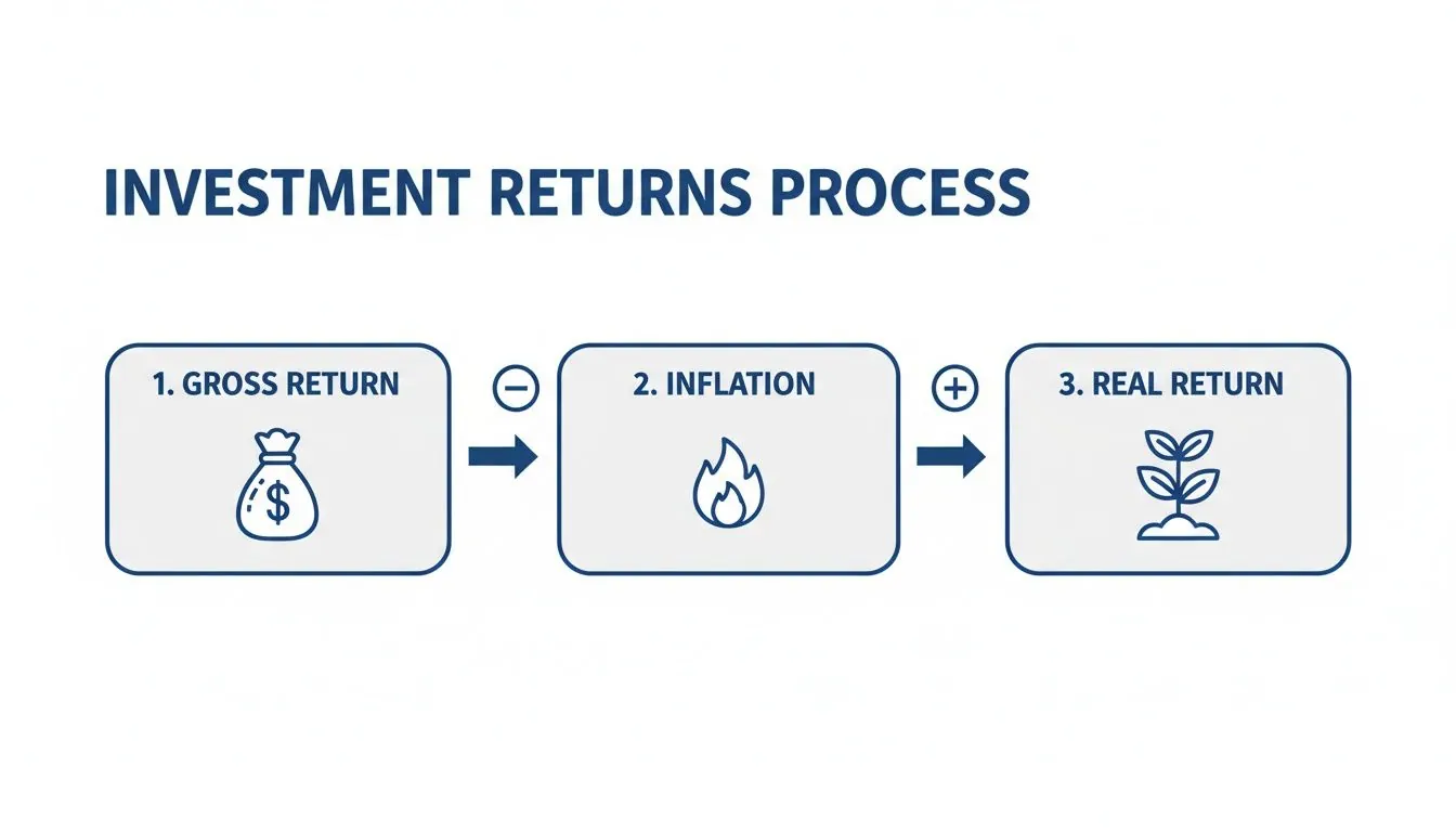
This shows that your nominal gains are just the beginning. What truly matters is what you can actually buy with your money at the end of the day.
Getting a handle on these calculations is the first step toward tracking your financial progress accurately. For a deeper dive, this guide on how to calculate portfolio returns accurately is a great resource. It helps you see past the marketing fluff and understand your real progress.
Measuring Your Performance Versus the Market

Calculating your overall return is a great start, but to really understand your performance, you need to dig deeper. Was it your stock picks that did the heavy lifting, or did you just get lucky with your timing? This is where a couple of professional-grade metrics come in: Time-Weighted Return (TWR) and Money-Weighted Return (MWR).
Imagine your portfolio is a garden. The TWR measures how well your plants grew on their own, ignoring when you added water or planted new seeds. It answers the question, “How good were the seeds I picked?”
The MWR, on the other hand, is your personal gardening report card. It looks at the final harvest, which absolutely depends on when you decided to plant more or pull some crops out. This one answers, “How skilled was I as the gardener?”
Time-Weighted Return: The Manager’s Scorecard
This is the metric you’ll see mutual funds and ETFs use. They have to report their TWR because it strips out the impact of investors moving money in and out, creating a level playing field to compare one fund manager to another. It purely measures the compound growth of one dollar invested from day one.
So, if a fund reports a 10% return for the year, its TWR is 10%. It doesn’t matter if investors flooded it with cash right before a big rally or bailed just before a dip. TWR is the perfect tool for judging an investment’s underlying strategy. Think of it as measuring the engine’s power, not the driver’s skill.
Money-Weighted Return: The Investor’s Reality
Your personal average investment rate of return is almost always a Money-Weighted Return. Why? Because it’s directly shaped by the timing and size of your own contributions and withdrawals.
If you happen to deposit a large chunk of cash right before the market soars, your MWR will look fantastic—likely better than the TWR. But if you invest right before a downturn, your MWR is going to take a hit.
The Money-Weighted Return tells the true story of your personal results. It combines the performance of your investments with the real-world consequences of your timing, giving you the complete picture of your actual financial outcome.
Getting a handle on both metrics is key. TWR helps you pick strong investments, while MWR reveals whether your timing decisions are helping or hurting your portfolio. Together, they offer a much clearer view of your financial journey. To see how these returns build up over the long haul, you can learn more about the cumulative rate of return and how it all fits together.
Setting Realistic Expectations with Benchmarks
Understanding your investment performance is one thing, but how do you know if your returns are actually any good? This is where benchmarks come in. Think of them as a yardstick for your portfolio, giving you the context you need to measure performance and set achievable financial goals.
Without a benchmark, investing is like driving without a speedometer or road signs. You’re moving, sure, but you have no idea how fast you’re going or if you’re even on the right path. Comparing your returns to a relevant index helps ground your expectations in reality.
Of course, the right benchmark depends on what you’re invested in. A portfolio heavy in stocks should perform very differently than one focused on bonds. The key is to match your comparison to your strategy and understand the timeless relationship between risk and reward.
Comparing Major Asset Classes
Historically, different types of investments have delivered wildly different results. The basic rule of thumb is that investors are compensated with higher potential returns for taking on greater risks—like the volatility that comes with owning stocks.
Here’s a simplified breakdown of what history tells us about long-term performance:
- Stocks: Representing a slice of ownership in a company, stocks are the most volatile but have historically offered the highest average returns. Over long periods, a diversified basket of stocks has been the most powerful engine for building wealth.
- Bonds: Essentially loans you make to a government or corporation, bonds are generally safer than stocks. Their returns are more modest, acting as a stabilizer in a portfolio rather than a primary growth driver.
- Cash Equivalents: This bucket includes things like high-yield savings accounts or short-term Treasury bills. They offer the lowest risk and, as you’d expect, the lowest returns, often struggling to even keep pace with inflation over time.
This difference in performance is known as the equity risk premium. It’s the extra return investors demand for choosing the rollercoaster ride of the stock market over the smoother path of bonds or cash. Knowing this helps you avoid the common mistake of expecting stock-like gains from your low-risk assets.
To put some numbers on it, let’s look at the long-term historical data.
Historical Returns Across Major Asset Classes
| Asset Class | Long-Term Average Annual Return (Nominal) |
|---|---|
| U.S. Stocks (e.g., S&P 500) | Around 10-12% |
| U.S. Government Bonds (10-Year) | Around 5-6% |
| Cash-Like Instruments (T-Bills) | Around 3-4% |
These figures, which span several decades, clearly illustrate the equity risk premium in action. While past performance is no guarantee of future results, this historical context is crucial for building a portfolio with realistic return expectations.
Looking Beyond a Single Country
While U.S. markets are often the default reference, a global perspective provides a much broader and more realistic benchmark. Global indices help you see how your portfolio stacks up against worldwide economic performance, not just one country’s market.
A great example is the MSCI World Index, which tracks large and mid-cap stocks across more than 20 developed nations. It gives a fantastic snapshot of global market health.
Historical data isn’t a crystal ball for future performance, but it is an invaluable map. It shows you the terrain, highlights potential routes, and helps you navigate toward your financial destination with a well-calibrated compass.
Backtested data for this index shows that from 1978 to 2025, it delivered annualized returns of roughly 8.5% to 8.7% over long stretches of 20 to 40 years. More recently, the decade ending in 2025 saw returns of about 10.9% per year, showing how shorter periods can easily overshoot the long-term average. To get a more detailed view, you can explore the MSCI World backtest results.
By using these kinds of benchmarks, you can build a resilient, diversified portfolio that aligns with your true goals and risk tolerance, steering clear of the temptation to chase unsustainable returns.
The Hidden Costs That Reduce Your Real Return
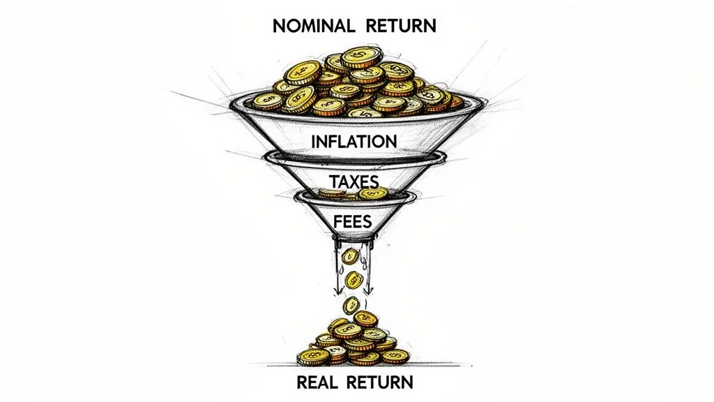
The number you see on your statement isn’t what you actually get to keep. Think of your nominal return like your gross salary—it’s the impressive figure before deductions. But your real return, the money that truly boosts your purchasing power, is your take-home pay.
Several invisible forces are quietly eating away at your investment gains over time. Understanding them is the only way to protect and maximize what you’ve worked so hard to build. These “hidden” costs are the difference between a good-looking number and actual wealth creation.
The three main drags on your portfolio are inflation, taxes, and fees. Each one takes a slice of your profits, and their combined effect can be staggering over a long investment horizon.
The Silent Thief: Inflation
Inflation is the most relentless of these costs. If your investments grow by 7% but the cost of living—everything from groceries to gas—rises by 3%, your real gain is only 4%. It’s a constant headwind that shrinks the future value of every dollar you earn.
To figure out your real rate of return, you simply subtract the inflation rate from your nominal return. It’s a straightforward but vital calculation for understanding your true progress.
The Inevitable Bite of Taxes and Fees
Next up are the more direct costs. Investment fees and taxes can create a substantial drag on your portfolio’s growth, acting like a small leak in a boat that becomes a big problem over a long journey.
These costs pop up in several forms:
- Management Fees: These are ongoing charges for professional fund management, often expressed as an expense ratio. Even a tiny percentage adds up massively over decades through the punishing math of reverse compounding. To really get a handle on this, you can learn more about what an expense ratio is and how it affects your bottom line.
- Trading Costs: Every time you or your fund manager buys or sells an asset, commissions or other transaction fees can be incurred.
- Capital Gains Taxes: When you sell an investment for a profit, the government takes its share, leaving you with less to reinvest.
Your net return is what’s left after all these costs are stripped away. It’s easy to focus on the pre-tax, pre-fee number, but your true average investment rate of return is the one that accounts for every single deduction.
For example, the performance gap between asset classes is well-known. Broad U.S. stocks have historically returned around 9–10% nominal per year, far outpacing long-term government bonds. However, this higher nominal return also brings potentially higher taxes and fees, making it crucial to manage costs to preserve as much of that premium as possible. You can explore more about these historical return figures on the NYU Stern School of Business website.
Bringing It All Together for Your Financial Future
Getting a handle on your average rate of return is a fantastic first step. It gives you a real, tangible number to understand how your money has performed. But the real magic happens when you turn that knowledge into a durable, real-world strategy that works for you. Think of the numbers and historical data as your map, not the final destination.
The market’s future is, and always will be, a mystery. Chasing a specific historical average can trap you in a cycle of emotional, impulsive decisions. The smartest investors know this. Instead of getting hung up on what they can’t predict, they double down on the handful of things they can actually manage.
Focusing on What You Can Actually Control
Your long-term success won’t come from perfectly timing the market or finding some secret formula for guaranteed returns. Spoiler alert: that doesn’t exist. It comes from the far less exciting—but infinitely more powerful—habit of consistently doing the right things.
Here’s what really moves the needle on building wealth over time:
- Your Savings Rate: How much you consistently set aside to invest has a much bigger impact on your future wealth than the market’s return, especially in the early years.
- Your Asset Allocation: Spreading your investments across different asset classes that match your risk tolerance and timeline is your single best defense against wild market swings.
- Keeping Costs Low: Every dollar you pay in fees or taxes is a dollar that isn’t compounding for you. Minimizing these costs is like giving your future self a raise.
- A Long-Term Mindset: Patience is your superpower. Sticking with your plan through the inevitable ups and downs is what lets the miracle of compounding do its work.
The goal isn’t just to understand returns; it’s to build a resilient financial plan that can weather any storm. When you focus on your savings, allocation, and costs, you give yourself the best possible odds of hitting your goals, no matter what the headlines are screaming about.
Common Questions About Investment Returns
Even after you’ve got the hang of calculating your returns, a few questions always seem to pop up. Nailing down the answers to these will give you the confidence to put these concepts into practice and sharpen your own investment strategy.
Let’s tackle some of the most common things investors wonder about their performance.
What’s a Good Average Return for My Retirement Portfolio?
The short answer? It depends. A “good” return is completely relative to your own goals, how long you have to invest, and how much risk you’re comfortable taking on.
Sure, the stock market has historically delivered around 8-10% per year before inflation, but that’s not the whole story. If you have a balanced retirement portfolio—which you should—it will include bonds and other assets that naturally lower that average. A diversified portfolio isn’t built to just chase the highest possible gains; it’s designed to smooth out the ride.
For long-term planning, most financial advisors will point you toward a more conservative real return of 4-6% (that’s after inflation). Why? Because it builds a safety buffer into your financial plan, helping you stay on track even if the market doesn’t repeat its historical highs.
Key Takeaway: Stop chasing a specific number. Instead, focus on the return your financial plan actually needs. A realistic, inflation-adjusted target is a far more powerful tool than a generic market average.
Why Is My Personal Return Different from the S&P 500?
It’s practically a guarantee that your personal return will never perfectly match a major benchmark like the S&P 500. Don’t worry—that’s completely normal. There are a few solid reasons why this happens:
- You’re Diversified: Your portfolio is likely much more than just 500 massive U.S. companies. You probably hold international stocks, bonds, or maybe even real estate, all of which move differently than the S&P 500.
- Cash Flow Timing Matters: The S&P 500’s return is a simple Time-Weighted Return (TWR). Your personal result, however, is a Money-Weighted Return (MWR), which is heavily influenced by when you add or withdraw cash.
- Reality Has Fees: The index is just a number; it doesn’t pay management fees or taxes. Your real-world portfolio does, and those costs inevitably create a drag on your performance over time.
Think of the S&P 500 as a useful yardstick for one part of the market, not a direct competitor you need to beat.
How Often Should I Check My Rate of Return?
Modern apps make it dangerously easy to check your portfolio 20 times a day. But honestly, this habit often does more harm than good, tempting you into making emotional, short-sighted moves.
If you’re investing for the long haul, checking in less frequently is far healthier for both your portfolio and your peace of mind.
A quarterly or semi-annual review is more than enough. This rhythm lets you see if you’re still on track toward your long-term goals and rebalance if necessary, all without getting whipsawed by the meaningless day-to-day market noise.
Ready to stop guessing and start tracking your true net worth with precision? PopaDex consolidates all your accounts into one clear dashboard, so you always know where you stand. Sign up for free and take control of your financial future today.