Our Marketing Team at PopaDex
Mastering the Modern Financial Dashboard

Think of a financial dashboard as the command center for your business. It’s a single, clear view of all your most important financial data, presented in real time. Instead of drowning in complex spreadsheets and scattered reports, you get actionable insights at a glance—from cash flow to profitability.
What Is a Financial Dashboard and Why Do You Need One?
Imagine trying to fly a plane using only last week’s weather report. You might get off the ground, but you’d be flying blind, completely unaware of the turbulence right in front of you. That’s what running a business feels like without a financial dashboard—you’re constantly reacting to old information.
A dashboard changes all that. It’s a tool that pulls together all your key financial metrics (KPIs) into one simple, visual hub. No more manually stitching together data from your accounting software, sales platform, and bank statements. The dashboard does it for you, giving you a live, unified story of your company’s performance.
This is the key difference between being a reactive manager and a proactive strategist. You stop just closing the books on last month and start making sharp, informed decisions about tomorrow.
Beyond Static Reports
Traditional financial reports, like your monthly P&L statement, are like a snapshot. They capture a single moment in time. They’re useful, sure, but they don’t tell you how you got there or where you’re headed next.
A financial dashboard, on the other hand, is a live video feed. It gives you continuous insight, letting you spot trends as they’re happening, catch problems before they blow up, and jump on opportunities the moment they appear.
A well-designed financial dashboard does more than just show you numbers; it helps you answer the big questions. It doesn’t just tell you what happened, it helps you figure out why and what you should do about it.
This real-time visibility is a massive competitive advantage. When you have up-to-the-minute data, you can pivot your strategy, manage cash flow with confidence, and get your entire team aligned on clear, data-driven goals.
The Core Benefits of a Financial Dashboard
Putting a centralized dashboard in place delivers some serious perks that directly boost your bottom line and make your operations run smoother. You’re essentially turning raw data into a strategic weapon.
Here’s what you stand to gain:
- Smarter, Faster Decisions: With all your critical numbers in one place, you can make confident calls without wasting time hunting for information.
- Total Financial Visibility: Get a complete, 360-degree view of your company’s financial health, from the big picture right down to the nitty-gritty details.
- Proactive Problem-Solving: Spot negative trends—like shrinking margins or rising customer acquisition costs—early enough to actually do something about them.
- Massive Time Savings: Automating data collection means you and your team can stop wasting hours on manual spreadsheet work. Some studies show managers can spend up to 80% of their time just gathering data—a problem dashboards completely solve.
At the end of the day, a financial dashboard is more than another reporting tool; it’s a management tool. It gives everyone, from the CEO to department heads, the information they need to do their jobs better. It builds a culture where performance is measured, understood, and owned by everyone. Without one, you’re just guessing.
The Essential Metrics Every Financial Dashboard Needs
A financial dashboard is only as good as the numbers it displays. Choosing the right metrics is like a pilot picking instruments for their cockpit—each one needs to send a clear, immediate signal about a critical part of the business. Just throwing every number you can find onto the screen creates a mess, not clarity. The real goal is to zero in on the vital signs that tell the true story of your company’s health.
These vital signs, known as Key Performance Indicators (KPIs), fall into four main categories. Each one answers a core question about your business, digging deeper than surface-level figures to show you what’s really happening on the ground. When you focus on these areas, your financial dashboard stops being a simple report and becomes a strategic tool for driving real growth and stability.
This chart gives a simplified look at how monthly revenue and expenses directly impact the resulting profit margin.
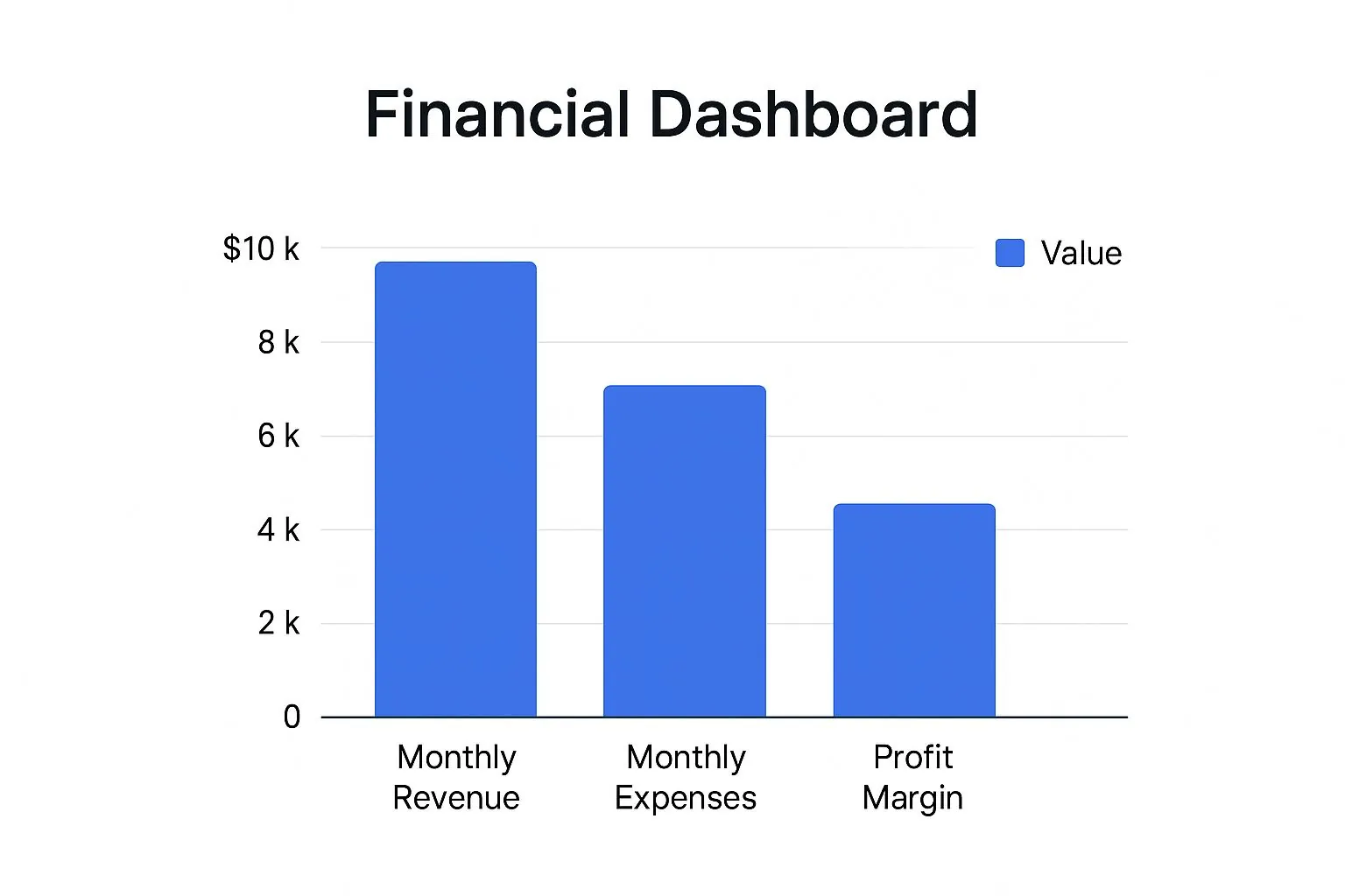
As you can see, the relationship is direct and powerful. Keeping an eye on this is fundamental for any business.
Below is a quick breakdown of the most critical metrics, what they measure, and why they matter for making strategic decisions.
Key Financial Metrics and Their Business Impact
| Metric Category | KPI Example | What It Measures | Strategic Question It Answers |
|---|---|---|---|
| Profitability | Net Profit Margin | The percentage of revenue left after all expenses are paid. | Are we actually making money from our core business model? |
| Liquidity | Current Ratio | The ability to cover short-term debts with current assets. | Can we pay our bills next month if something unexpected happens? |
| Efficiency | Accounts Receivable Days | The average time it takes to collect cash from customers. | Is our cash getting tied up in unpaid invoices? |
| Growth | Customer Lifetime Value (CLV) | The total revenue expected from a single customer over time. | Are we acquiring customers who will provide long-term value? |
This table isn’t exhaustive, but it highlights the kind of strategic thinking that a well-designed dashboard enables, moving you from just looking at numbers to asking the right questions.
Measuring Profitability
Profitability metrics get right to the point, answering the most fundamental business question: “Are we making money?” These KPIs cut through the noise of revenue figures to show how good your company is at turning sales into actual profit. They’re the ultimate report card on your business model’s health.
- Gross Profit Margin: This is the percentage of revenue left after you subtract the cost of goods sold (COGS). A high margin means you have a solid markup and you’re managing production costs effectively.
- Net Profit Margin: This is the bottom line. It calculates the slice of revenue remaining after all expenses—taxes, interest, and operating costs—have been deducted. It’s the clearest picture of your overall profitability.
- EBITDA (Earnings Before Interest, Taxes, Depreciation, and Amortization): This metric gives you a pure look at your core operational profitability by stripping out the noise from accounting and financing decisions.
Gauging Liquidity
Liquidity metrics tackle a more urgent question: “Can we pay our bills right now?” It doesn’t matter how profitable you are on paper; if you run out of cash to cover short-term debts, you’re in serious trouble. These metrics are your early warning system for cash flow problems.
A business without enough liquidity is like a car with a full tank of gas but no oil in the engine. It looks fine on the surface, but it’s heading for a complete breakdown. You simply can’t afford to ignore these numbers.
Here are the key liquidity ratios to watch:
- Current Ratio: Calculated as current assets divided by current liabilities, this gives you a quick snapshot of your ability to cover short-term obligations. A ratio above 1.0 is generally a good sign.
- Quick Ratio (Acid-Test Ratio): This is a tougher, more conservative test. It excludes inventory from your assets because you can’t always sell it off quickly to raise cash.
Analyzing Operational Efficiency
Efficiency metrics answer the question: “How well are we using what we have?” These KPIs show you how effectively your team is using company assets and managing day-to-day operations to bring in revenue. Getting more efficient directly boosts your profits and strengthens cash flow.
- Operating Cash Flow (OCF): This number shows how much cash your regular business operations are generating. Consistently positive OCF is a hallmark of a healthy, sustainable company.
- Accounts Receivable Days: This tells you the average number of days it takes for customers to pay you after a sale. A lower number is always better because it means cash is flowing back into your business faster.
- Accounts Payable Days: On the flip side, this measures how long your company takes to pay its own suppliers. Stretching this out (within reason) can be a smart way to manage your cash.
Tracking Growth and Investment
Finally, growth metrics help you look ahead by asking, “Are we growing in a sustainable way?” These KPIs are essential for startups, companies breaking into new markets, and any business with an eye on long-term expansion. They tell you about your market traction and whether your investments are paying off.
For anyone managing an investment portfolio or a public company, Understanding Stock Performance YTD is another critical metric for measuring progress within a specific calendar year.
- Customer Acquisition Cost (CAC): This is the total sales and marketing spend required to land one new customer. You need to know this number.
- Customer Lifetime Value (CLV): This projects the total revenue you can expect from a single customer over the entire relationship. For a business to work, its CLV has to be much higher than its CAC.
- Monthly Recurring Revenue (MRR): For any subscription business, MRR is the lifeblood. It creates a predictable stream of income and is a primary indicator of growth momentum.
Designing a Dashboard for Clarity and Action

A great financial dashboard goes beyond flashy graphics or cramming every possible metric onto one screen. Its real value is much simpler: can it tell a complex financial story with absolute clarity? Can someone look at it and get it in seconds? Effective design is more than making things look nice; it’s a functional necessity that turns raw numbers into a clear path for action.
Think of it like an airplane cockpit. A pilot isn’t bombarded with every single piece of data at once. The most critical instruments—altitude, speed, heading—are front and center. Everything else is organized neatly around them. That same principle, known as visual hierarchy, is the secret to a dashboard that empowers decisions instead of causing confusion.
The ultimate goal is to cut through the noise. By strategically arranging your data, you create a natural flow that helps users process information without having to think too hard. This means putting your most important KPIs where the eye naturally falls first (usually the top-left) and using size and color to highlight what truly matters.
Choosing the Right Visuals for Your Data
Not all charts are created equal, and picking the wrong one can hide the very insights you’re trying to surface. Applying effective data visualization techniques is non-negotiable. The trick is to match the type of chart to the story your data needs to tell.
Here’s a quick cheat sheet:
- Line Charts: These are your go-to for showing trends over time. Want to track Monthly Recurring Revenue (MRR) or Operating Cash Flow? A line chart will instantly reveal patterns, growth, and seasonality.
- Bar Charts: Perfect for comparing different categories. A bar chart makes it incredibly easy to see how various products, regions, or marketing channels are performing against one another.
- Pie or Donut Charts: Use these sparingly. They’re only effective for showing the composition of a whole, like breaking down expense categories. If you have more than a few slices, they become cluttered and hard to read.
- KPI Cards: Sometimes, the most powerful visual is just a big, bold number. Use these for your headline metrics like Net Profit Margin or Current Ratio, often with a small arrow or color to show if the trend is moving up or down.
When you select the right tool for the job, you make the data intuitive. This is a critical first step when you decide to https://popadex.com/visualize-financial-data/ for maximum clarity.
The Power of Color and Whitespace
Color is one of your most powerful design tools, but it needs a purpose. A common rookie mistake is to splash bright, competing colors everywhere, which just creates visual chaos. A limited, intentional color palette is far more effective at guiding the user’s attention and adding another layer of meaning.
A minimalist approach often works best. Stick to a neutral background and use one or two accent colors to highlight what’s important—think green for positive trends and red for negative ones. This simple strategy communicates performance before the user even reads a number.
Just as important is whitespace—the empty space around your charts and numbers. Giving each element room to breathe prevents your dashboard from feeling cramped and overwhelming. It dramatically improves readability and creates a clean, professional look that builds confidence in the data you’re presenting.
How Financial Dashboards Work in the Real World
Theory is great, but the true power of a financial dashboard clicks when you see it in action. These aren’t just fancy charts for massive corporations; they’re practical, problem-solving tools for businesses of every shape and size. By turning raw numbers into a clear story, dashboards give leaders the confidence to navigate tricky situations.
Let’s look at how three very different businesses use financial dashboards to tackle specific challenges, keep an eye on what matters most, and get real results. These examples show just how game-changing a focused view of the right data can be.
The SaaS Startup Trying to Extend Its Runway
For a startup backed by venture capital, cash is everything. It’s the oxygen they need to survive. The main goal is simple: grow like crazy without burning through all your money before the next funding round. The leadership team lives and dies by one metric above all others: burn rate.
Their financial dashboard is built around this reality. You won’t find it cluttered with dozens of vanity metrics. Instead, it’s laser-focused on:
- Monthly Cash Burn: A single, bold number showing how much cash they’re spending each month.
- Customer Acquisition Cost (CAC): How much it costs to land one new paying customer.
- Customer Lifetime Value (CLV): The total revenue they expect to make from a single customer over time.
- Months of Runway: The most important KPI of all, calculated by dividing the cash in the bank by the monthly burn rate.
By watching these numbers daily, the CEO spotted a dangerous trend: their CAC was climbing faster than their CLV. The dashboard showed that one marketing channel, while bringing in tons of sign-ups, was attracting low-value customers who left quickly. They immediately shifted their ad budget to more profitable channels, cutting their burn rate by 15% and adding three critical months to their runway. That decisive move, made possible by the dashboard’s clarity, gave them the breathing room they needed to close their next round of funding.
The E-commerce Store Trying to Optimize Ad Spend
An online store selling directly to consumers is in a constant balancing act. They have to spend on ads to get customers, but overspending can completely erase their profit margins. Their entire business hinges on mastering the delicate dance between acquisition costs and the long-term value of a customer.
Their dashboard is designed to give them a complete picture of their marketing funnel’s financial health. It pulls in data from their sales platform, ad networks, and accounting software to visualize:
- Return on Ad Spend (ROAS): For every dollar they put into ads, how many dollars in revenue come back out?
- Average Order Value (AOV): How much does a typical customer spend in a single purchase?
- Repeat Purchase Rate: What percentage of customers come back for more?
The e-commerce dashboard uncovered a powerful insight: customers who bought a specific entry-level product were three times more likely to make a second purchase within 60 days. This wasn’t just a sales trend; it was a clear signal about customer behavior.
Armed with this knowledge, the marketing team built entire campaigns around that one gateway product for new buyers. This strategy didn’t just increase their repeat purchase rate; it also let them bid more aggressively for ads, since they knew the first sale was likely to lead to more revenue down the line. It turned their marketing from a cost center into a predictable profit machine.
The Service Agency Trying to Maximize Profitability
A digital marketing agency juggles multiple client projects, each with its own budget, timeline, and team. Their biggest headache? Making sure every single project is actually profitable. It’s shockingly easy to lose track of billable hours or let “scope creep” turn a lucrative contract into a money pit. The same principles apply to personal finance, where a good net worth tracker helps ensure your personal projects and assets are working for you.
The agency’s financial dashboard zeroes in on profitability at the project and team levels. It connects to their time-tracking and project management software to monitor:
- Project Gross Margin: The project’s revenue minus the direct costs (which is mostly the team’s time).
- Billable Utilization Rate: The percentage of an employee’s time that’s actually being billed to a client.
- Realization Rate: Of all the hours they bill, what percentage do they actually collect in payment?
The dashboard quickly red-flagged a major client account where the gross margin was consistently dipping below their 20% target. Drilling down, the operations manager discovered that junior employees were spending way too many unbillable hours on tasks. This insight led to a frank conversation with the client to redefine the project’s scope and adjust the budget. It also sparked an internal training initiative to work more efficiently, turning a losing account into a profitable one.
In a similar vein, investors focused on generating passive income use specialized platforms that act as their own financial dashboards. If you’re curious how this works for personal investing, check out some of the best dividend tracker tools to see this concept in action.
The Future of Financial Dashboards and Analytics
The financial dashboard is getting a serious upgrade. For years, it’s been a rearview mirror—great for showing you where you’ve been, but not much help with the road ahead. That’s all changing. The next generation of dashboards is moving beyond just showing what happened last quarter and starting to answer a far more powerful question: “What’s likely to happen next?”
This isn’t just about prettier charts. We’re talking about a fundamental shift from basic data visualization to true analytical power. Driven by advances in artificial intelligence and machine learning, these new tools can dig through mountains of data, spot subtle patterns a human would miss, and serve up forward-looking insights. It’s the difference between reading a history book and having a strategy guide for the future.
And it’s not just a niche trend; it’s a booming market. The global financial analytics market—the brains behind these modern dashboards—is set to jump from $10.70 billion in 2025 to a massive $22.64 billion by 2032. This explosion is happening because businesses everywhere are hungry for data-driven answers. You can dive deeper into this market expansion and financial analytics trends to see just how fast things are moving.
Predictive Analytics and Forecasting
One of the biggest game-changers is baking predictive analytics right into the dashboard. Imagine having a data scientist built directly into your reporting tool. Instead of the old, clunky process of exporting data to build complex forecast models somewhere else, the dashboard now does all the heavy lifting for you.
This makes advanced forecasting something anyone can use, not just the quant jocks. Your dashboard can now generate surprisingly accurate predictions for the metrics that matter most.
- Cash Flow Forecasting: By learning from your historical payment cycles and sales seasonality, the dashboard can predict future cash crunches or surpluses. This gives you a heads-up to secure a line of credit or maybe hold off on that big purchase.
- Sales Trend Identification: Machine learning algorithms can spot emerging sales patterns or flag customer segments at risk of churning, giving you a chance to step in before the revenue numbers take a hit.
- Inventory Management: For any business holding stock, these dashboards can forecast demand for specific items, helping you avoid running out of your bestsellers while not overstocking the slow movers.
Automated Anomaly Detection
Another killer feature becoming standard is automated anomaly detection. With old-school dashboards, you had to stare at charts and hope you’d spot something weird. An intelligent dashboard, on the other hand, is always watching.
An intelligent financial dashboard acts like a vigilant watchdog for your business finances. It doesn’t wait for you to find a problem; it alerts you the moment something deviates from the norm, turning potential disasters into manageable issues.
When a metric suddenly spikes or dips outside its normal range—like a sudden drop in profit margin on a top-selling product or an unexpected jump in expenses from one department—the system automatically flags it. This lets you investigate and fix problems almost as they happen, long before they show up on a stuffy month-end report.
The Rise of Hyper-Connected Data
Finally, the dashboard of the future is all about seeing the whole picture. It’s breaking down the walls between departments by pulling in data from every corner of the business, not just the accounting software.
Think about a single dashboard that combines your financials with:
- Marketing campaign performance from Google Ads or Facebook.
- Customer support ticket volume from your helpdesk platform like Zendesk.
- Website traffic and user behavior from tools like Google Analytics.
When you connect these dots, you can uncover incredibly powerful relationships. You might discover that a spike in customer support tickets is a leading indicator of a drop in customer retention three weeks later. Finding these cross-functional insights is where the real strategic advantage lies, turning the financial dashboard into the central nervous system for the entire organization.
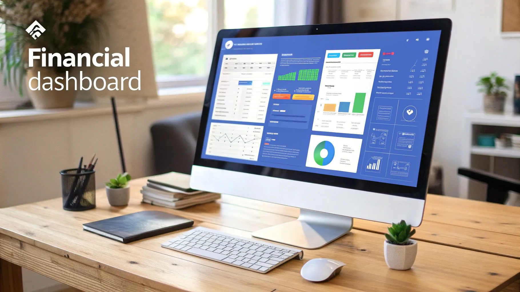
How PopaDex Simplifies Your Dashboard Creation
Building a custom financial dashboard from scratch sounds like a job for a data analyst, right? Many businesses hit a wall trying to pull together scattered data sources or wrestling with complicated, code-heavy platforms. PopaDex cuts right through that complexity, turning what feels like a massive technical project into a straightforward process anyone can handle.
Our platform is built on a no-code philosophy. You don’t need to be a developer to create a professional-grade dashboard. Instead of fighting with APIs or writing scripts, you simply use our intuitive, pre-built connectors to link all your financial accounts—bank statements, credit cards, investment portfolios—in just a few clicks.
From Complex Data to Clear Visuals in Minutes
The real magic happens in the PopaDex drag-and-drop interface. As soon as your data is connected, you can start building your ideal financial dashboard immediately. Our library is packed with pre-built widgets and chart templates designed to make your most important metrics pop.
Just take a look at the PopaDex interface. You can see how easy it is to select and arrange different visual elements to build a dashboard that fits your exact needs.

The clean layout and obvious options show how we’ve made powerful visualization tools accessible to everyone, not just the tech experts.
The goal here is simple: spend less time fighting with software and more time acting on your insights. We handle the technical heavy lifting so you can focus on what your numbers are actually telling you.
Our platform automates one of the most tedious parts of financial analysis. This behind-the-scenes work is all part of our financial data aggregation system, which keeps your dashboard constantly updated with the latest information without you having to lift a finger.
A Three-Step Path to Financial Clarity
Getting started with your PopaDex dashboard is a quick, three-part process that takes you from scattered data to actionable insights faster than you’d think.
- Connect Your Sources: Securely link all of your financial accounts using our huge library of over 15,000 bank connectors.
- Customize Your View: Pick from a gallery of pre-designed templates or build your own dashboard from scratch with our drag-and-drop widgets.
- Share and Collaborate: Securely share your dashboard with your team, financial advisor, or anyone else who needs to be in the loop to get everyone aligned on the same data-driven goals.
This streamlined approach means you can have a fully functional, personalized financial dashboard up and running in minutes, not weeks. PopaDex makes sophisticated financial tracking an achievable reality for any business or individual, putting the power of data directly into your hands.
Got Questions About Financial Dashboards? We Have Answers.
Even after seeing what a financial dashboard can do, you probably have some practical questions about getting one up and running. Let’s tackle the most common ones to clear things up so you can move forward.
What Is the First Step to Creating a Financial Dashboard?
Before you even think about charts or data sources, you have to define your goals. Seriously. The absolute first step is to ask yourself: What critical business questions does this dashboard need to answer? What specific decisions will I make based on this information?
Starting with your objectives is the only way to ensure you track metrics that actually matter. It’s the difference between a dashboard cluttered with pretty but useless numbers and one that becomes a core part of your decision-making process. Once your goals are crystal clear, then you can pinpoint the KPIs and data sources you’ll need.
A dashboard without clear goals is just a collection of charts. A dashboard built to answer specific questions is a strategic tool that drives action.
Can I Build a Financial Dashboard Using Spreadsheets?
Technically, yes, you can rig up a basic dashboard in Excel or Google Sheets. But this approach is riddled with problems that can quickly turn into a massive headache. Spreadsheets demand constant manual updates, are notoriously prone to human error, and simply can’t handle real-time data.
Think about it: every time you want an update, you’re manually exporting data from multiple systems and pasting it in. It’s a huge time-suck. Dedicated tools, on the other hand, automate all that, offer interactive visuals that spreadsheets can’t match, and scale right alongside your business. They’re a far more reliable and professional choice for anyone serious about financial tracking.
How Do I Ensure My Financial Dashboard Data Is Secure?
When you’re dealing with sensitive financial information, data security is more than a feature—it’s everything. Any professional dashboard tool worth its salt will have robust security measures built-in.
Here’s what you should look for as a bare minimum:
- Data Encryption: This protects your information both while it’s being transferred and when it’s stored.
- Role-Based Access Controls: This lets you decide exactly who sees what, so team members only get the data relevant to their jobs.
- Regulatory Compliance: Look for tools that comply with standards like GDPR. It’s a strong signal that they take data privacy seriously.
No matter which solution you choose, always use secure connections for your data and never, ever store sensitive financial details in an unsecured spreadsheet.
Ready to build a financial dashboard that gives you total clarity and control? With PopaDex, you can connect all your accounts in minutes and create a personalized view of your finances without writing a single line of code. Stop guessing and start making data-driven decisions today by visiting https://popadex.com.