Our Marketing Team at PopaDex
Your Custom Investment Tracking Spreadsheet Guide
An investment tracking spreadsheet, whether in Excel or Google Sheets, is a seriously powerful tool. It gives you something most apps can’t: complete control and total privacy over your financial life.
Sure, apps are convenient. But a custom spreadsheet lets you track exactly what matters to your personal strategy. All without subscription fees or handing over sensitive data. It’s about building a system that fits you like a glove, not squeezing into a one-size-fits-all box.
Why a Custom Spreadsheet Beats Any App
In a world overflowing with slick investing apps, you might wonder why so many experienced investors stick with the humble spreadsheet. The answer boils down to three simple, powerful words: control, privacy, and customization.
An app decides what you can track and how you see it. Your spreadsheet? It follows your rules, period. This hands-on approach does more than just organize your numbers; it builds a much deeper understanding of how your portfolio actually works. When you’re the one building the formulas and structuring the data, you’re not just watching from the sidelines—you’re in the driver’s seat. That direct involvement is what leads to smarter, more confident decisions.
Total Customization and Control
The biggest win for a custom investment tracking spreadsheet is its raw flexibility. You’re never stuck with an app developer’s idea of what’s important.
- Track Absolutely Anything: Seamlessly pull in stocks, bonds, ETFs, real estate, and even alternative assets like crypto or rare collectibles. Everything lives in one place.
- Invent Your Own Metrics: Go way beyond standard ROI. You can calculate your personal savings rate, project future dividend income, or track your progress toward a big goal, like a down payment on a house.
- Design Your Perfect Dashboard: Build visual dashboards with charts and graphs that show you what you want to see, from asset allocation breakdowns to how you’re performing against your own benchmarks.
While you have ultimate control in a spreadsheet, it’s still smart to know what other specialized tools are out there, like the various DeFi portfolio tracker tools for those who are deep in the crypto space.
A spreadsheet evolves from a simple list of numbers into a dynamic financial model. It becomes an extension of your own investment philosophy, tailored precisely to your goals. That’s a level of personalization most apps just can’t touch.
Unmatched Privacy and Cost-Effectiveness
Data privacy is a huge deal. Third-party apps often push you to link your brokerage accounts, which can feel like leaving your financial front door wide open. With a spreadsheet, your information stays with you, on your computer. It’s a major reason so many DIY investors swear by this method.
It’s also interesting to see the data back this up. Statistics from 2025 show a significant number of investors prefer custom spreadsheets for the privacy, flexibility, and the ability to create custom reports for things like tax planning or retirement modeling—features many apps lock behind a paywall.
This hands-on approach helps you see the bigger picture. If you’re looking to expand your tracking beyond just investments, our guide on building a net worth tracking spreadsheet is a great next step.
Custom Spreadsheet vs. Investing App
So, how do the two approaches really stack up head-to-head? It often comes down to a trade-off between convenience and control.
| Feature | Custom Spreadsheet (Excel/Sheets) | Standard Investing App |
|---|---|---|
| Customization | Limitless. Track any asset, create custom metrics, design your own dashboard. | Limited. You’re restricted to the app’s pre-defined categories and views. |
| Privacy | 100% Private. Your data stays on your device and is never shared. | Varies. Often requires linking accounts, sharing data with third parties. |
| Cost | Free. Uses software you likely already have (Excel, Google Sheets). | Often has fees. Can be a monthly subscription or transaction-based cost. |
| Learning Curve | Higher. Requires some knowledge of formulas and spreadsheet functions. | Low. Designed to be user-friendly and intuitive out of the box. |
| Automation | Manual or semi-automated. Requires manual data entry or custom scripts. | Highly automated. Automatically syncs transactions and updates balances. |
| Asset Support | Universal. Can handle stocks, crypto, real estate, collectibles—anything. | Often limited. May not support alternative or non-traditional assets. |
Ultimately, there’s no single “best” answer for everyone. An app offers plug-and-play simplicity, while a spreadsheet delivers unparalleled power and privacy for those willing to put in a bit of effort.
Laying the Foundation of Your Tracker
This is where the magic really begins. We’re about to build the core architecture of your investment tracker: a rock-solid transaction log.
Think of this part of the spreadsheet not just as a list, but as the single source of truth for your entire portfolio. I can’t stress this enough: getting this part right is the most critical step of the whole process. A clean, well-structured log makes every future calculation and analysis almost effortless. A messy one, on the other hand, will cause you endless headaches down the road.
The goal here is simple: create a permanent, unchangeable record of every single move you make. Every buy, every sell, and every dividend received gets its own dedicated row. This chronological ledger is the raw data that will fuel everything else in your dashboard, from performance metrics to your asset allocation charts.
The Essential Columns for Your Transaction Log
To build a log that’s both powerful and future-proof, each entry needs to capture specific pieces of information. Let’s start by creating a new sheet or tab in your spreadsheet. I like to call mine “Transactions” to keep things obvious.
Now, set up the following headers in the first row. These columns are absolutely non-negotiable for accurate tracking.
- Date: When did the transaction happen? Format this column strictly as a date (e.g., MM/DD/YYYY) so you can do time-based analysis later.
- Ticker Symbol: The stock or ETF symbol, like VTI, AAPL, or MSFT. Consistency is your best friend here, as it’s key for grouping trades by asset.
- Transaction Type: What action did you take? I highly recommend using a dropdown list with options like “Buy,” “Sell,” “Dividend,” and “Split” to avoid typos and keep your data clean.
- Quantity: How many shares were involved? Even for a sale, just list this as a positive number. We’ll handle the math for that later on.
- Price per Share: The price you paid or received for each share. This is the price before you factor in any commissions or fees.
- Fees: Any commission or transaction fee you paid. Logging this separately is crucial for accurately calculating your true cost basis and returns.
By structuring your log this way, you create a detailed history that can answer pretty much any question you have about your portfolio. For instance, you can easily filter by “AAPL” to see every single trade you’ve ever made for Apple.
Here’s a quick look at what a clean transaction log should look like. This is the backbone of the entire system.
See how each transaction gets its own row? This creates a clean, organized historical record that’s a breeze to read and analyze.
Handling More Complex Transactions
Of course, your investment journey will involve more than just simple buys and sells. A truly robust transaction log needs to handle these less common events gracefully to keep your data accurate.
For example, when a stock splits, it doesn’t change the value of your holding, but it does change your share count. To record a 2-for-1 stock split, you’d simply add a new row with the Transaction Type as “Split.” The quantity would be the new shares you received, but the price and fees would both be $0. This keeps your share count correct without messing up your cost basis.
Pro Tip: For Dividend Reinvestment Plans (DRIPs), I always treat them as two separate events for maximum clarity. First, log the cash dividend using the “Dividend” type. Then, right below it, add a new “Buy” transaction for the fractional shares you purchased with that dividend, listing the fee as $0. This gives you a crystal-clear paper trail.
This meticulous approach to data entry is the real secret to a reliable investment tracker. It ensures that every single calculation you build on top of this foundation—from ROI to unrealized gains—is based on complete and accurate information. Trust me, your future self will thank you for the diligence you put in now.
Automating Your Portfolio with Live Data
Let’s be honest: manually updating stock prices is a soul-crushing task. A static spreadsheet is a history book, but a dynamic one is a live command center for your money. This is where we bring your tracker to life by plugging it into real-time market data.
This single upgrade is the most powerful one you can make. It transforms your simple log into a responsive tool that reflects the true, current state of your investments, saving you hours of tedious work and giving you an up-to-the-minute view of your portfolio.
Unlocking Live Data in Google Sheets
If you’re using Google Sheets, your secret weapon is the GOOGLEFINANCE function. Think of it as a direct line to Google Finance, capable of pulling a massive amount of financial info right into your cells.
Let’s say you have a “Portfolio” sheet where cell A2 contains a ticker symbol like “GOOGL”. Getting its current price is dead simple.
In the cell where you want the live price, just type this:
=GOOGLEFINANCE(A2, "price")
Boom. Google Sheets instantly shows the latest market price for Alphabet Inc. This one function is the cornerstone of automation for countless DIY investors. It’s so powerful that many investment templates are built around it.
But it does way more than just price. You can grab all sorts of essential data:
- Company Name:
=GOOGLEFINANCE(A2, "name") - 52-Week High:
=GOOGLEFINANCE(A2, "high52") - Daily Change:
=GOOGLEFINANCE(A2, "change") - Currency:
=GOOGLEFINANCE(A2, "currency")
It even handles currency exchange rates. To see the live EUR to USD rate, you’d use =GOOGLEFINANCE("CURRENCY:EURUSD"). For anyone holding international assets, this is an absolute must-have.
Harnessing Data Types in Excel
Excel people, you’re not left out. If you have a Microsoft 365 subscription, you get something just as powerful: the Stocks data type. It’s a slick feature that turns a plain text ticker into a rich data object stuffed with information.
First, just type your ticker symbols (like MSFT, AAPL, NVDA) into a column. Then, highlight those cells, head to the Data tab on the ribbon, and click Stocks.
Excel works its magic, converting each ticker into a special data entity, marked with a little building icon. Now for the cool part. Click on a cell, and a small “Insert Data” button appears. Clicking it gives you a dropdown list of dozens of financial fields you can pull into adjacent columns.
For instance, to get the price of the stock in A2, you’d type this formula in the next cell:
=A2.Price
This intuitive dot notation makes pulling data a breeze. You can quickly add more fields:
=A2.Change=A2.[Company name]=A2.[P/E]
A Quick Comparison:
GOOGLEFINANCEis formula-based, perfect for pulling specific, targeted data points. Excel’s Stocks data type feels more object-oriented, making it incredibly fast to add tons of related data once your tickers are set up. Both are fantastic.
Going Further with Historical Data
A great tracker doesn’t just show you where you are; it shows you how you got there. For digging into trends, you’ll want to fetch historical data.
In Excel, the STOCKHISTORY function is built for exactly this. It can return an entire array of historical prices for a stock over a date range you specify. For example, to see the closing price for Apple every day last month, you could use a formula like this:
=STOCKHISTORY("AAPL", "2024-04-01", "2024-04-30")
This spills a ready-to-use table of dates and prices right onto your sheet. You can use this to build performance charts or calculate volatility. Having this kind of data on tap is a huge leg up for serious portfolio analysis. Seeing a complete investment portfolio tracker shows you just how powerful these automated data points can be when they all come together in a comprehensive dashboard.
Putting Your Spreadsheet to Work: Calculating Key Performance Metrics
With your transaction log set up and live data piped in, it’s time for the fun part. We’re moving beyond simple data entry and into real analysis. This is where your custom spreadsheet truly starts to pay off, turning all those raw numbers into clear, actionable insights about your portfolio’s health.
These calculations are the engine of your dashboard. They’ll help you cut through the daily market noise and see what’s actually happening with your investments. We’ll start with the basics and then build up to the metrics that give you a much deeper understanding of your performance.
The image below shows you exactly why this is so powerful. Visualizing things like your portfolio’s value over time or your current asset mix gives you an instant, high-level read on your financial standing.
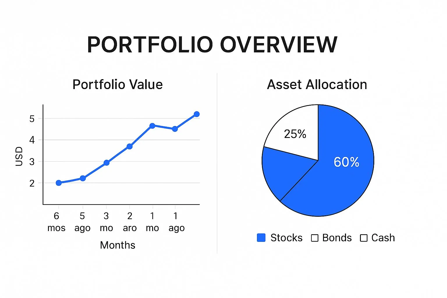
A simple chart like this tells a story at a glance, showing you where you’ve been and how your assets are diversified right now.
Calculating Your Total Portfolio Value
First up, the most fundamental metric: your portfolio’s current market value. Since we already set up our live data feeds, this is actually pretty simple. I like to do this in a new, clean ‘Dashboard’ or ‘Portfolio’ sheet where I can summarize all my holdings.
For each stock you own, you need to pull two key pieces of data:
- Total Shares Owned: This is where a
SUMIF(orSUMIFS) formula comes in handy. You’ll point it at your ‘Transactions’ sheet to add up the ‘Quantity’ for all “Buy” trades and subtract the ‘Quantity’ for all “Sell” trades for each specific ticker. - Current Price: This is the live price you’re pulling in with the
GOOGLEFINANCEfunction or Excel’s Stocks data type.
From there, the math is easy: Total Shares Owned * Current Price. Do this for every holding, add them all up, and you’ve got your total portfolio value—a real-time snapshot of your entire investment world.
Determining Your Cost Basis
Knowing what your portfolio is worth today is great, but it’s only half the story. To truly gauge your performance, you have to know what you paid for everything. We call this the cost basis.
A simple approach is to use another SUMIFS formula on your transaction log. For each stock, you’d add up the total cost (Quantity * Price per Share + Fees) for all your “Buy” transactions.
But here’s a pro tip: for a much more accurate picture, especially if you buy shares of the same company at different times and prices, you should calculate the Weighted Average Cost per Share. This gives you the average price you’ve paid for all the shares you currently own.
The formula is: (Total Cost of All Buys) / (Total Shares Purchased)
This single number is incredibly valuable for making smart decisions about when to sell and for accurately calculating your gains.
Distinguishing Realized vs. Unrealized Gains
Not all profits are created equal. There’s a huge difference between gains on paper and cash in your bank account, and your spreadsheet needs to track both.
- Unrealized Gain/Loss: This is your “paper” profit on an asset you still hold. You calculate it with:
(Current Price - Average Cost per Share) * Shares Owned. It shows you what you could make if you sold today. - Realized Gain/Loss: This is the actual profit or loss you’ve locked in from a completed sale. Look at your “Sell” transactions and use this formula:
(Sell Price - Average Cost per Share at time of sale) * Shares Sold.
Tracking both is essential for tax planning and for honestly assessing which of your investment ideas have actually worked out. This level of detail is something you just can’t get from a standard brokerage app.
Many modern templates are built specifically to handle and visualize these metrics. For instance, the best trackers out there incorporate formulas to automatically calculate ROI, average costs, holding values, and realized profits. If you want to see how these advanced concepts are structured in a ready-made solution, check out this popular Google Sheets stock portfolio tracker to get some inspiration.
Essential Spreadsheet Formulas for Investors
To bring all this together, you’ll be leaning on a few core spreadsheet functions. Whether you’re in Google Sheets or Microsoft Excel, these formulas are the building blocks of a powerful investment tracker.
| Metric | Google Sheets Formula Example | Excel Formula Example | Purpose |
|---|---|---|---|
| Current Stock Price | =GOOGLEFINANCE("GOOG") |
=STOCKHISTORY("MSFT",TODAY()) |
Fetches real-time or recent price data for a specific stock ticker. |
| Total Shares Owned | =SUMIFS(Qty, Tickers, "AAPL", Type, "Buy") - SUMIFS(Qty, Tickers, "AAPL", Type, "Sell") |
=SUMIFS(Qty, Tickers, "AAPL", Type, "Buy") - SUMIFS(Qty, Tickers, "AAPL", Type, "Sell") |
Calculates the net number of shares held for a specific stock. |
| Total Cost Basis | =SUMIF(Tickers, "TSLA", TotalCost) |
=SUMIF(Tickers, "TSLA", TotalCost) |
Sums the total amount paid for all shares of a specific stock. |
| Unrealized Gain | =(CurrentPrice - AvgCost) * SharesOwned |
=(CurrentPrice - AvgCost) * SharesOwned |
Calculates the potential “on paper” profit for a holding you still own. |
| Total Portfolio Value | =SUM(IndividualHoldingValues) |
=SUM(IndividualHoldingValues) |
Adds up the current market value of all individual holdings. |
These formulas are the heart of your spreadsheet’s analytical power, automating the calculations that give you true insight into your portfolio’s performance.
Calculating True Return on Investment
Finally, we get to the ultimate measure of success: Return on Investment (ROI). This metric tells you, in simple terms, how well your money is actually working for you.
You can calculate ROI for each individual holding or for your entire portfolio. The basic formula for a single stock looks like this:
ROI (%) = (Net Profit / Total Cost) * 100
Here, Net Profit is your Unrealized Gain/Loss plus any dividends you’ve received, and Total Cost is your cost basis for that holding.
The resulting percentage is the great equalizer. It lets you compare the performance of a $500 investment against a $10,000 one on an apples-to-apples basis. It’s the bottom line for judging whether an investment was a winner.
Building Your Visual Investment Dashboard
The numbers in your investment tracking spreadsheet are the engine, but a visual dashboard is what truly puts you in the driver’s seat. Raw data is powerful, of course, but seeing it come to life in charts and graphs gives you an immediate, intuitive feel for your financial picture. This is where we stop crunching numbers and start building an actionable command center.
Think of it this way: instead of scrolling through endless rows of data to spot a trend, a simple chart reveals it in seconds. That speed allows you to make faster, more confident decisions about your strategy, especially when it’s time to rebalance or size up potential risks.

Visualizing Your Asset Allocation
The first chart every investor should build is an asset allocation pie chart. It’s the quickest way to answer the most fundamental question: “Where is my money, really?” Since proper diversification is a cornerstone of sound investing, this chart acts as your instant, brutally honest health check.
To get this built, you first need a small summary of your holdings grouped by asset class (like US Stocks, International Stocks, Bonds, Real Estate, Crypto). I use a SUMIF or SUMIFS formula to pull the current market value for each category from my main portfolio sheet. It’s a clean way to consolidate everything.
Once you have that little summary table ready, creating the chart is a breeze:
- Just highlight your data—the asset class labels and their total values.
- In either Excel or Google Sheets, go to Insert > Chart.
- Pick the Pie Chart option.
Instantly, you get a visual breakdown of your portfolio. Is your allocation matching your target? Are you accidentally way too concentrated in a single stock or asset? This chart makes it impossible to ignore the reality of your portfolio.
A well-built dashboard does more than just show you data; it forces you to confront your portfolio’s reality. A pie chart revealing that 80% of your net worth is tied up in a single tech stock is a powerful—and sometimes necessary—wake-up call.
Breaking Down Holdings by Sector or Industry
While the big-picture asset allocation is key, digging a layer deeper gives you even more valuable insight. For this, a bar chart is the perfect tool for seeing your holdings by industry sector (think Technology, Healthcare, Financials) or even by individual position size.
This is how you spot concentration risk that might be hiding inside a broad asset class. Your pie chart might show a healthy allocation to “US Stocks,” but a sector-specific bar chart could reveal that nearly all of those stocks are in the highly volatile tech industry. That’s a risk you need to see.
To create this, you’ll want to add a “Sector” or “Industry” column to your main portfolio summary. You can often pull this info automatically with Excel’s Stocks data type or find it with a bit of quick research. Then, just use the same Insert > Chart process, but this time, select a Bar Chart. This visual makes it crystal clear which sectors are really dominating your investments.
Creating a Top Performers Summary Table
Charts are fantastic for high-level views, but sometimes you just need to see the specific winners and losers driving your returns. A simple, dynamic summary table is perfect for this. While it’s not a chart, it’s a critical visual element on any good dashboard.
Set up a small table right on your dashboard that highlights the must-know info for your top positions.
Key Columns to Include:
- Ticker Symbol: The stock’s identifier.
- Current Value: The total market value of your position.
- Unrealized Gain/Loss ($): Your paper profit or loss on the position.
- ROI (%): The total return on investment for that specific holding.
You can use functions like SORT or FILTER in Google Sheets (or the Sort & Filter tools in Excel) to automatically rank your holdings by their current value or performance. This creates a dynamic “leaderboard” that instantly shows you which investments are having the biggest impact—for better or for worse. This focused view is a vital part of a truly comprehensive investment tracking spreadsheet.
Your Top Spreadsheet Questions, Answered
As you get your hands dirty building out your investment tracker, you’re bound to run into some head-scratchers. That’s a good thing—it means you’re creating a tool that’s actually tailored to your unique financial world. Let’s walk through some of the most common questions and tricky situations that trip people up.
Think of this as your go-to troubleshooting guide. Getting these details right will give you the confidence to manage and adapt your tracker for years, keeping your financial command center running without a hitch.
How Do I Handle Stock Splits and Dividends?
Stock splits and dividends are completely normal, but they can wreak havoc on your formulas if you don’t log them properly. The goal is simple: keep your transaction history clean and accurate.
For a stock split, the trick is to add a new line without messing up your cost basis. Here’s how I do it:
- Add a new row in your transaction log on the date of the split.
- I use a specific Transaction Type here, like “Split,” to keep things clear.
- In the quantity column, enter the new shares you just received. If you had 50 shares and it was a 2-for-1 split, you’d enter 50 new shares.
- Here’s the critical part: set the cost or price to zero. A split isn’t a purchase; it just changes the number of slices in your ownership pie. This updates your share count without falsely inflating how much you’ve invested.
Dividends, especially the ones that get automatically reinvested (DRIPs), need a clear paper trail. I always log them as two separate entries. First, a “Dividend” transaction showing the cash that landed in your account. Right after, a “Buy” transaction for the fractional shares that were purchased, making sure the cost is the exact amount of the dividend and the fee is zero.
Can This Spreadsheet Track Crypto and International Stocks?
Absolutely. That’s one of the best reasons to build your own spreadsheet—it can hold all your different assets in one place, something most brokerage dashboards can’t do.
To track crypto, just add an “Asset Type” column to your transaction log. You can label each entry as “Stock,” “ETF,” or “Crypto.” While GOOGLEFINANCE can handle some major pairs like "CURRENCY:BTCUSD", you might need a third-party script or add-on to pull live prices for a wider universe of altcoins. But the core mechanics of tracking buys, sells, and quantity are exactly the same as for stocks.
For international stocks, the biggest hurdle is always currency conversion. The
GOOGLEFINANCEfunction is a lifesaver. You can pull a live exchange rate—for example, with=GOOGLEFINANCE("CURRENCY:EURUSD")—and use it to convert the value of your foreign holdings back into your home currency. This gives you that single, unified portfolio view we’re all after.
By adding a “Local Currency” column and another for the current exchange rate, you can accurately track performance across global markets without having to piece everything together manually. We get a lot of questions on this, and you can dig into more answers on our detailed FAQ page.
What Are the Most Common Formula Errors?
Even those of us who live in spreadsheets run into formula errors. In an investment tracker, they usually boil down to funky data formatting or a simple bad cell reference.
Here are the usual suspects:
#N/Aor#ERROR!withGOOGLEFINANCE: This almost always means the ticker symbol is wrong. Double-check for typos (like “APPL” instead of “AAPL”). For international stocks, you might need the exchange code, like “TSE:SHOP” for Shopify on the Toronto Stock Exchange.#VALUE!Errors: This classic error pops up when you try to do math on a cell that contains text. It’s a dead giveaway that a “Price” or “Quantity” cell might have a dollar sign typed into it or was accidentally formatted as text.- Incorrect
SUMIFSTotals: If yourSUMIFSformula is giving you zero or a weird number, it’s a mismatch between your criteria and your data. Make sure the text you’re looking for (e.g., “Buy”) is an exact match to what’s in your transaction log—no sneaky extra spaces.
Honestly, keeping your data clean and consistently formatted is your best defense against 99% of these formula headaches.
Ready to skip the formulas and get a complete, automated view of your entire financial world? PopaDex offers an intuitive platform that consolidates everything from your bank accounts and investments to property and crypto holdings. With support for over 15,000 banks and advanced visualizations, it’s the easiest way to track your net worth in real-time. Start your free trial today and take control of your financial future. Learn more at https://popadex.com.