Our Marketing Team at PopaDex
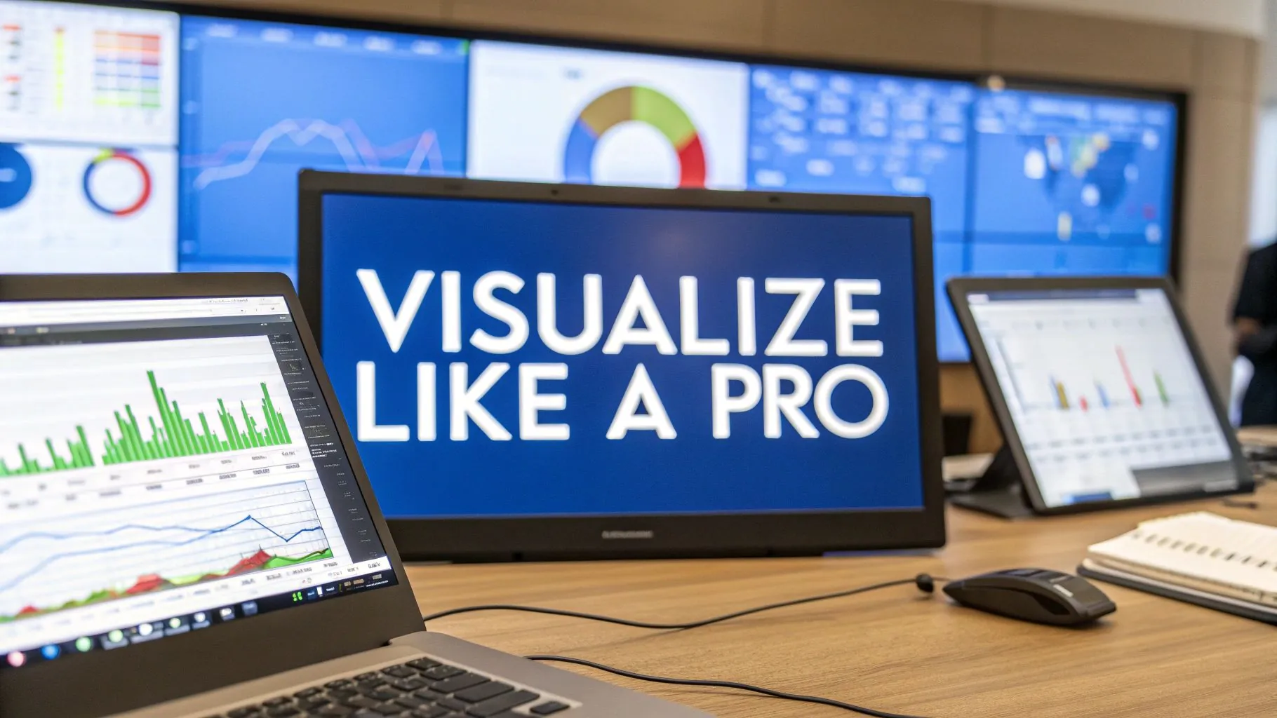
Visualize Financial Data Like a Pro
When you visualize financial data, you’re doing more than just making pretty charts. You’re translating raw, complex numbers from a spreadsheet into something intuitive and immediately understandable. It’s a process that shines a light on trends, opportunities, and risks that would otherwise stay buried in endless rows and columns.
Why Visualizing Financial Data Matters
Let’s be real: dense spreadsheets are where financial clarity goes to die. They’re packed with critical information, sure, but their format makes it incredibly difficult for our brains to process what’s important. This is where the power to visualize financial data becomes a game-changer, whether you’re running a business or managing your own investments.
The biggest win is turning abstract figures into a compelling story. Instead of just seeing a number for “quarterly profit,” you see a sharply rising line chart that screams success. This immediate understanding is crucial for making smart, timely decisions.
From Numbers to Narratives
Think about a standard profit and loss statement. In a spreadsheet, it’s a long, monotonous list of revenues and expenses. But when you visualize that same data, you can instantly see which expense categories are ballooning or which revenue streams are lagging.
It’s the difference between reading a grocery list and seeing a photo of the finished meal.
The real magic of financial visualization is its ability to translate complex data into a universal language. A well-designed chart communicates performance and opportunity far more powerfully than any text-based report ever could.
This isn’t some new-fangled idea. The practice actually dates back centuries. One of the first known statistical graphs was created way back in 1644 by Michael Florent Van Langren. He used a simple line graph to show the huge variation in estimates of the longitude between two cities, proving that a visual could expose discrepancies much more clearly than a table of numbers. You can dive deeper into the early days of data visualization and see how it grew into a vital financial tool.
Driving Actionable Insights
Great data visualization does more than just present information; it pushes you toward action. It helps everyone—from the CEO to the marketing team—instantly grasp performance, spot hidden patterns, and tackle red flags before they spiral into major problems. For modern finance pros and business leaders, this is more than a “nice-to-have” skill. It’s essential.
Here’s what you stand to gain when you get good at visualizing your financials:
- Faster Decision-Making: Key metrics like cash flow, net profit, and customer acquisition costs jump right off the page. This drastically shortens the time it takes to go from analysis to action.
- Improved Trend Spotting: It’s way easier to see emerging market trends, seasonal spending habits, or the long-term impact of a business strategy when it’s plotted visually over time.
- Enhanced Communication: When you share a dashboard with your team or investors, everyone is looking at the same picture. This gets everyone on the same page, sparking productive conversations instead of confusion.
Choosing the Right Chart for Your Financial Story
Picking the right chart is a lot like telling a story. If you choose the wrong words, you can confuse or even mislead your audience—even if your numbers are perfect. This is about more than just grabbing a basic line or bar graph. It’s about matching the visual format to the specific financial insight you’re trying to share.
The whole point is to help people visualize financial data in a way that just clicks. It should feel intuitive and, above all, truthful. As this infographic shows, getting it right has some serious business benefits.
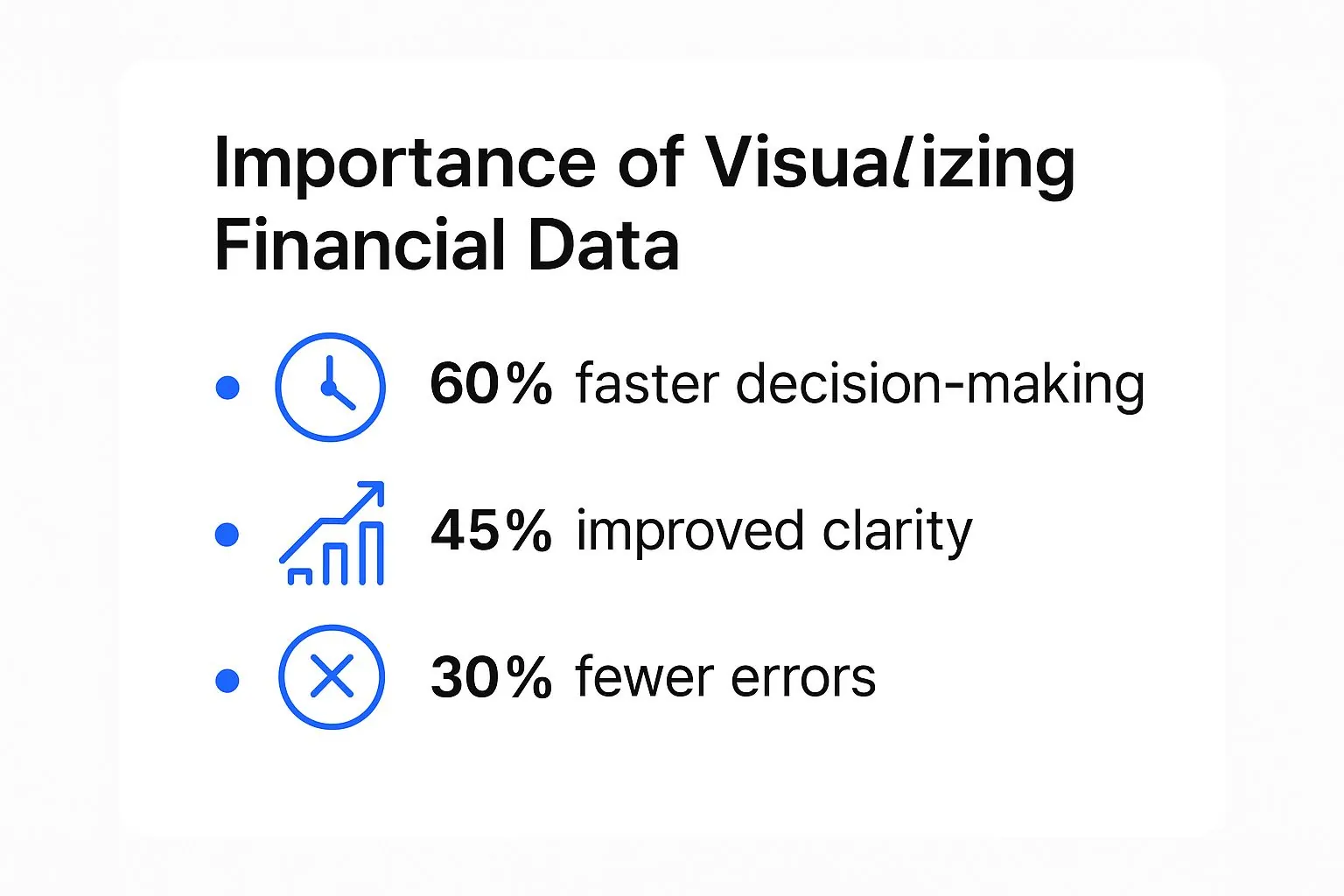
It’s pretty clear: good visuals lead to faster decisions, better clarity, and fewer mistakes. That alone makes a powerful case for ditching raw spreadsheets for something more dynamic.
Believe it or not, our ability to do this so well is a relatively recent development. The game really changed in the second half of the 20th century with the advent of computers. Pioneers like John W. Tukey and Jacques Bertin laid the groundwork with new statistical methods. Then, in 1983, Edward Tufte’s book, The Visual Display of Quantitative Information, pushed everyone to prioritize clarity and efficiency.
Tufte even introduced the sparkline—those tiny trend lines you now see everywhere in financial dashboards. It was a simple but brilliant way for analysts to get a quick read on massive datasets.
Matching Chart Types to Financial Goals
Every chart has a specific job. A line chart is brilliant for tracking revenue over a year, but it’s a terrible choice for showing where that revenue came from. You have to start by asking: what question am I trying to answer for my audience?
Here’s a quick rundown based on common goals:
- To Show Change Over Time: Use a line chart for continuous data like stock prices or monthly recurring revenue. For discrete periods, like comparing quarterly profits, a classic bar chart is your best bet.
- To Compare Values: Need to see how sales in one region stack up against another? The bar chart is your best friend here. It’s simple, clear, and universally understood.
- To Show Composition: Please, step away from the pie chart! For showing parts of a whole, a stacked bar chart or a treemap is far more effective. They’re especially useful when you have lots of categories, like breaking down a diverse investment portfolio.
- To Understand Relationships: A scatter plot is fantastic for spotting correlations. For example, you can use it to see if there’s a link between your marketing spend and new customer sign-ups.
To make this even easier, here’s a quick reference table I use when I’m deciding what visual to build.
Choosing the Best Chart for Financial Data
| Analysis Goal | Best Chart Type | When to Use It |
|---|---|---|
| Track performance over time | Line Chart | To show trends in continuous data, like monthly sales or website traffic. |
| Compare different categories | Bar Chart | To compare distinct items, such as regional sales figures or product performance. |
| Show parts of a whole | Stacked Bar Chart | To show how a total is broken down into components, like revenue by product line. |
| Illustrate a financial journey | Waterfall Chart | To visualize how a starting value is affected by a series of positive and negative changes. |
| Analyze stock price movements | Candlestick Chart | To display the open, high, low, and closing prices of a stock for a specific period. |
| Identify data relationships | Scatter Plot | To see if a correlation exists between two different variables, like ad spend and conversions. |
This table covers the most common scenarios you’ll encounter, helping you quickly select a chart that tells an accurate and compelling story.
Advanced Charts for Deeper Stories
Sometimes, a simple bar or line chart just won’t cut it. For more complex financial narratives, you need to pull out the specialized tools.
A waterfall chart is a fantastic way to break down the cumulative effect of positive and negative numbers. You could use it to show exactly how you got from starting revenue to final net profit, detailing the impact of new sales, refunds, and operating costs along the way. It tells a clear, step-by-step financial story.
Another powerhouse is the candlestick chart, which is non-negotiable for anyone analyzing stock performance. It cleverly packs four key data points—open, high, low, and close—into a single shape. This gives traders a much more nuanced view of price movements and market sentiment than a simple line chart ever could.
Choosing the right visualization means you stop just presenting data and start communicating meaning. Your goal is to guide your audience to the same conclusion you reached, and the right chart is your most persuasive tool.
Of course, the best visuals are born from clean, well-organized information. Before you even open a charting tool, you have to get your data in order. Our guide on effective financial data aggregation walks you through the practical steps to consolidate your numbers—the essential first step to creating flawless and insightful visualizations.
Preparing Your Data for Flawless Visualization

The most impressive charts are completely worthless if they’re built on a shaky data foundation. Before you can even think about visualizing your financial data, you have to get it in order. This crucial first step ensures your charts aren’t just pretty, but also accurate and trustworthy.
Think of it like building a house. You wouldn’t dream of putting up walls before pouring a solid concrete foundation. The same logic applies here. Your raw data is the uneven ground, and data preparation is the process of creating that unshakeable base.
Tackling Common Data Headaches
Let’s be honest—financial data rarely arrives in a pristine, ready-to-use format. It’s often messy, inconsistent, and riddled with little issues that can quietly sabotage your charts. The whole point of preparation is to methodically clean and structure this information.
One of the most common problems is dealing with missing values. Imagine you have monthly sales records, but the data for April is completely blank. Just plotting this would create a misleading dip in your chart. A better approach is to use an imputation method, like taking the average of March and May, to fill the gap—as long as you note the adjustment.
Another headache I see all the time is inconsistent formatting. Your U.S. sales team might log transactions as USD ($1,200.50) while the team in Europe uses EUR (€1.100,50). Without standardization, your software will likely misinterpret these as text instead of numbers. You absolutely must convert everything to a single currency and a uniform numeric format to get a true picture.
Structuring Data for Clarity and Comparison
Once your data is clean, the next job is to structure it for analysis. This usually means using aggregation and normalization—two powerful techniques for uncovering the real story in your numbers.
Aggregation is all about summarizing raw data to make it more meaningful. Your bank statement lists hundreds of individual transactions, which is way too granular for a high-level overview. By aggregating these into monthly totals for categories like “Groceries,” “Utilities,” and “Subscriptions,” you turn all that noise into a clear spending pattern.
Similarly, daily sales figures can be overwhelming. Roll them up into weekly or monthly totals, and suddenly you can spot broad trends that were completely invisible before. This is a fundamental step for visualizing financial data over time.
Normalization, on the other hand, puts different metrics on a common scale so you can compare them fairly. Let’s say you want to compare the efficiency of two departments. Department A brought in $500,000 in revenue with 50 employees, while Department B generated $350,000 with 25 employees.
At first glance, Department A looks like the winner. But when we normalize the data to “Revenue per Employee,” a different story emerges:
- Department A: $10,000 per employee
- Department B: $14,000 per employee
Suddenly, it’s clear that Department B is actually more efficient. Normalization is absolutely key for making these kinds of fair, apples-to-apples comparisons.
Building a trustworthy visualization starts long before you choose a chart type. It begins with the meticulous work of cleaning, structuring, and standardizing your data to ensure every data point tells the truth.
This level of preparation is also critical for specific financial processes. For instance, analyzing freight cost recovery data demands absolute precision; without clean data, spotting recovery opportunities is next to impossible. This behind-the-scenes work is what separates a pretty picture from a powerful decision-making tool.
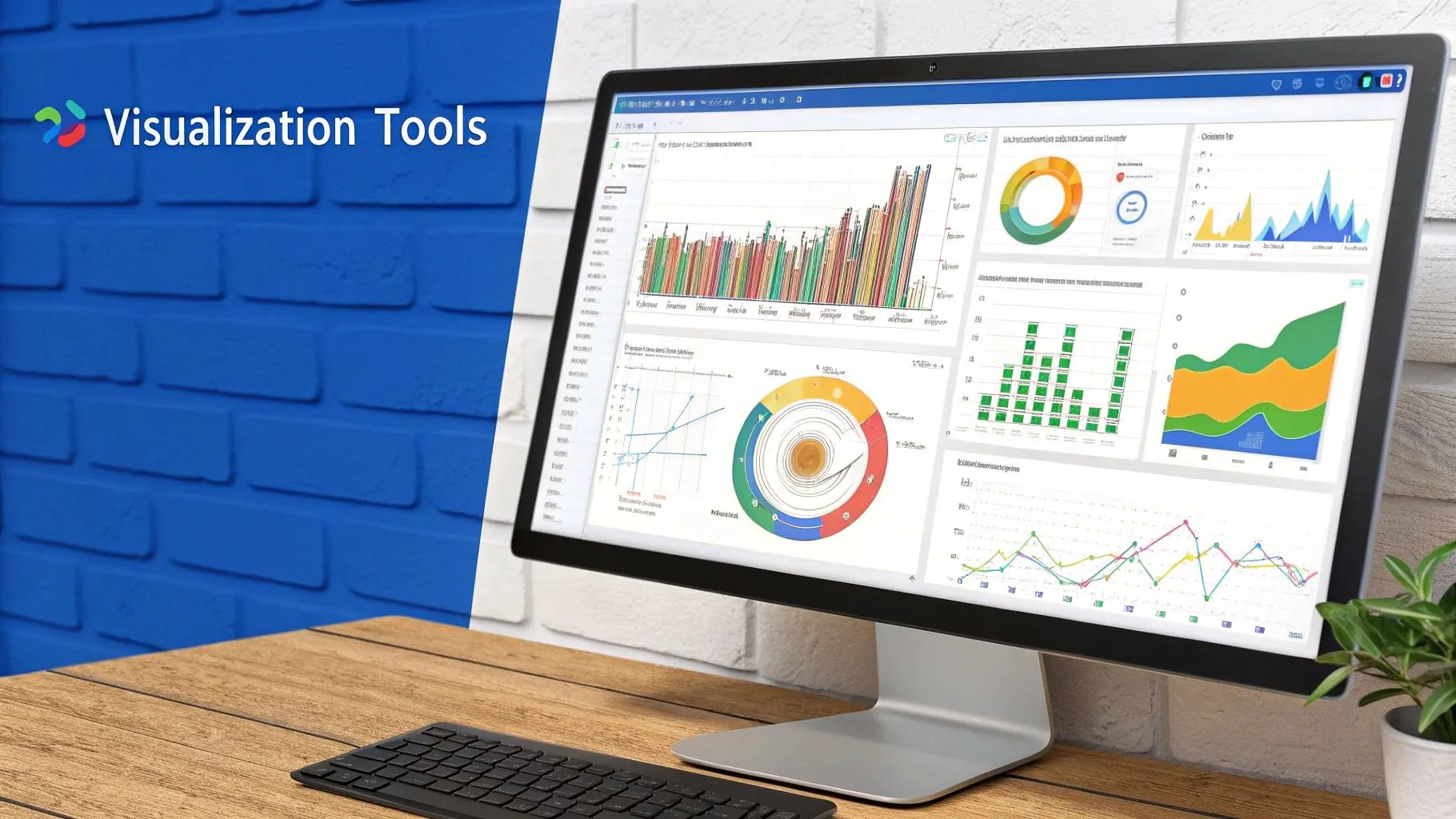
Building an Interactive Financial Dashboard
This is where all your hard work starts to pay off. We’re moving beyond flat, lifeless charts and building something truly dynamic: a financial dashboard that empowers you and your team to actually explore the numbers. The goal isn’t just to present data; it’s to create an interactive experience that invites questions and delivers clear, immediate answers.
A great interactive dashboard feels less like a stuffy report and more like a conversation. It lets users dig deeper and satisfy their own curiosity on the spot. When someone asks, “What’s behind that Q3 revenue spike?” they shouldn’t have to wait for an analyst to run a new report. They should be able to click, filter, and find the answer for themselves in seconds.
Designing for Interaction and Insight
So, what makes a dashboard truly interactive? It’s all about features that allow for on-the-fly analysis. This is what separates a basic chart from a real decision-making tool.
The most fundamental feature is the filter. Imagine you have a global sales dashboard. With a simple dropdown menu, a manager can instantly slice the entire view to show only the “North America” region or just the “Software as a Service” product line. This simple action provides immediate, granular analysis without needing a dozen different versions of the same report.
Another game-changer is linked charts. This is a design principle where interacting with one chart automatically updates all the other visuals on the dashboard. For instance, clicking on the “January” bar in a monthly sales trend chart could instantly update a nearby pie chart to show the product mix for that specific month. It’s a fluid, intuitive way to see connections between different data points.
Key Principles for Financial Dashboard Design
To visualize financial data effectively, your dashboard has to be built with clarity and purpose. Believe me, the layout and design choices are just as important as the data itself.
First, put your most critical Key Performance Indicators (KPIs) front and center. I’m talking about metrics like Net Profit, Cash Flow, and Monthly Recurring Revenue (MRR). These should be impossible to miss, often displayed as large, single-number “cards” right at the top. This gives anyone who opens the report an instant health check of the business.
Next, use color with intention. Don’t just throw in a rainbow for decoration. Instead, assign specific meanings:
- Green: Signals positive performance or hitting a target.
- Red: Flags underperformance, potential risks, or areas needing attention.
- Neutral Colors (Grays, Blues): Perfect for contextual data that doesn’t carry an explicit good or bad weight.
Finally, keep it clean. A good dashboard guides the user’s eye naturally from the high-level summary down to the nitty-gritty details. Use whitespace generously to avoid a cramped, overwhelming feel. For a practical example of these principles in action, a well-designed personal net worth dashboard helps individuals track their financial progress with the same kind of clarity and ease.
A successful dashboard doesn’t just display data; it provokes thought. It’s designed to answer the first question and then inspire the user to ask the next one.
The effort we put into visualizing financial data today is supported by an incredible amount of historical context. Modern analysis often pulls from massive datasets covering centuries of economic activity. The Global Financial Database, for example, provides harmonized time series for things like GDP since 1790 and equities since 1694 from around 200 countries. This depth of information gives today’s dashboards a powerful foundation, allowing us to spot patterns that span decades, not just quarters.
Common Mistakes in Financial Visualization
Great visualization isn’t just about what you put in; it’s about what you leave out. Even with perfect data and a clear objective, a few common blunders can completely torpedo the credibility of your financial reports. When you’re tasked with visualizing financial data, your absolute top priorities have to be honesty and clarity. That means actively steering clear of the traps that can mislead your audience, intentionally or not.
One of the oldest and most deceptive tricks in the book is manipulating the Y-axis. Imagine a company’s revenue ticked up modestly from $1 million to $1.1 million over the year. If you start the Y-axis at $950,000 instead of zero—a technique known as a truncated axis—that small 10% gain suddenly looks like a monumental spike. It’s a classic way to distort reality and instantly lose trust.
Dodging “Chartjunk” and Color Chaos
Another pitfall is something the legendary data expert Edward Tufte famously called “chartjunk.” This is all the visual noise that does nothing but distract from the data itself. Think heavy gridlines, 3D effects that obscure values, busy background images, or a dozen different labels screaming for attention. The goal is to let the numbers tell their story, not to drown them in decoration.
Beyond the clutter, color is a powerful tool that’s so often misused. If you use a color scheme that isn’t friendly to people with color blindness (which affects about 1 in 12 men), a big slice of your audience might not be able to read your chart correctly. Always opt for colorblind-friendly palettes and use more than just color—like distinct patterns or direct labels—to tell data series apart.
The most effective financial visualizations are ruthlessly simple. They put the data front and center, stripping away every single element that doesn’t directly help with understanding. This kind of clarity builds trust and leads to smarter, more informed decisions.
One last mistake I see all the time is mashing together unrelated metrics on a dual-axis chart. Plotting something like “Website Traffic” on one axis and “Company Revenue” on the other can create a powerful illusion of correlation where none actually exists. Just because two lines trend in the same direction doesn’t mean one is causing the other. It’s a dangerous visual coincidence that can lead to some seriously flawed business strategies.
By sidestepping these common mistakes, you ensure your charts aren’t just pretty pictures but honest, effective, and inclusive tools. And if you’re looking to apply these principles to your own finances, a dedicated personal net worth tracker can help you visualize your progress clearly and accurately, without the misleading fluff.
Of course. Here is the rewritten section, crafted to sound human-written, expert-driven, and aligned with the provided PopaDex blog post examples.
Your Questions, Answered
Jumping into financial visualization always brings up a few practical questions. It’s one thing to have the data, but it’s another thing entirely to turn it into something secure, accurate, and genuinely useful.
Let’s tackle some of the most common things people ask when they’re getting started. This is all about turning raw numbers into clear, actionable stories, and that means having the right tools and security practices locked in from day one.
What Are the Best Free Tools to Start Visualizing Financial Data?
You don’t need an expensive software suite to get started. In fact, some of the best tools are probably already on your computer. Both Google Sheets and Microsoft Excel have surprisingly powerful charting features that are perfect for creating your first reports and basic dashboards.
When you feel ready to create something more dynamic and shareable, these are your best free options:
- Tableau Public: This is the free version of an industry-leading tool. It lets you build some seriously impressive, interactive dashboards that you can share online.
- Microsoft Power BI Desktop: Another powerhouse, this free desktop application connects to a ton of different data sources and helps you create detailed, professional-looking visualizations.
While the free versions have their limits, they pack more than enough punch to help you master the fundamentals. You can produce some great-looking work for personal finance or small-scale projects without spending a dime.
The tool you choose is less important than how well you use it. A simple, clear line chart in Google Sheets that tells a story is infinitely more valuable than a cluttered, confusing dashboard built in a fancy program.
How Do I Visualize Data with Sensitive Information?
This is non-negotiable: security comes first with financial data. If you’re using any cloud-based platform, your first move should be to check that it’s compliant with key security standards like SOC 2 or ISO 27001. For highly sensitive information, sticking with on-premise solutions or a private cloud is always the safest bet.
When it comes to sharing, never just send out a public, unprotected link. Always use the platform’s secure sharing features, which require people to log in and prove who they are. You can also export dashboards as password-protected PDFs for an extra layer of security.
And a critical best practice: always anonymize your data by scrubbing any personally identifiable information (PII) before you even upload it.
How Often Should I Update My Financial Dashboards?
There’s no single right answer here—it all comes down to who is using the dashboard and what decisions they need to make. The update frequency has to match the pace of their work.
Think about it this way:
- Operational Dashboards: These are for teams in the trenches, looking at things like daily sales or support tickets. They need data in near real-time, or at the very least, updated daily.
- Tactical Dashboards: Managers use these to check on weekly progress for projects or marketing campaigns. A weekly refresh is usually perfect.
- Strategic Dashboards: Executives look at these for the big-picture view of the company’s financial health. An update every month or quarter is often all that’s needed.
Matching your data refresh schedule to what your audience actually needs is the key to making sure your dashboards are always relevant and never ignored.
Ready to get a clear, consolidated view of your own financial world? PopaDex gives you intuitive tools to visualize your complete net worth, track investments across multiple currencies, and build a solid plan to reach your goals. Start your free trial today.